
BrandCulture
Transforming the identity of a London-based agency with 20 years’ experience at the intersection of brands & culture.
Project:
Rebrand
Role:
Creative direction/
ART DIRECTION/ identity designProject Overview:The world doesn't revolve around brands, but it's possible to increase their gravitational pull.
BrandCulture had been doing that work since 2004 — spotting moments in culture and turning them into commercial results, using proprietary frameworks honed across twenty years. What was missing was an articulation that made that breadth visible. Twenty years in, the market still saw a partnerships agency.
The Theory of Relevancy came with the brief as the answer. A framework for what they had always done, applied by a team of Relevance Creators.
The identity had to carry it. That meant holding two things in the same system: the rigour behind the strategic output, and the flair of the creative work. Culture to commerce, without either side losing to the other. It had to also speak not just to who BrandCulture were, but who they intended to become.
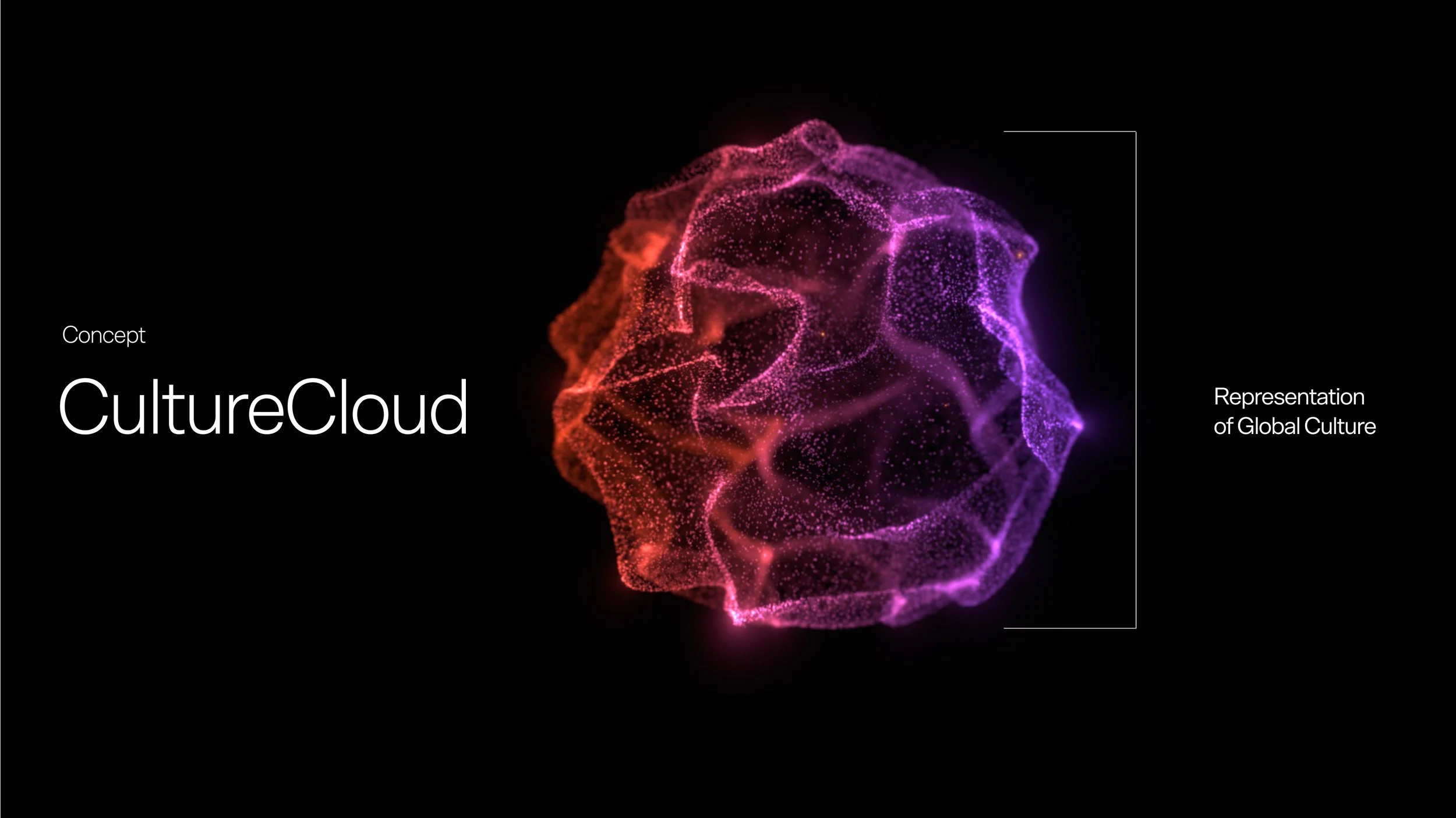
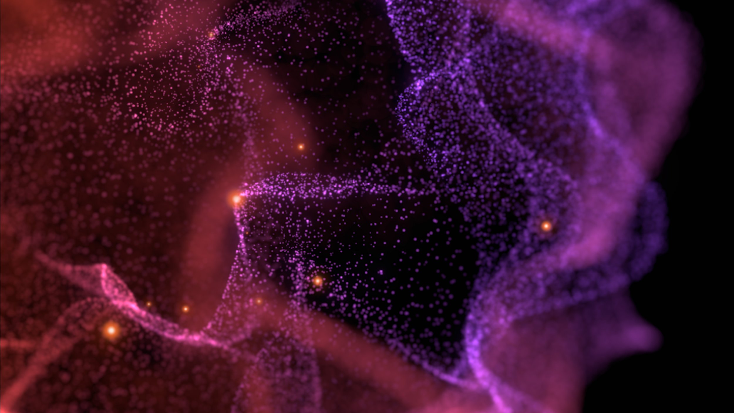
The Concept:At the heart of the identity is a device I designed to represent global culture, and the invisible field of influence surrounding every individual.
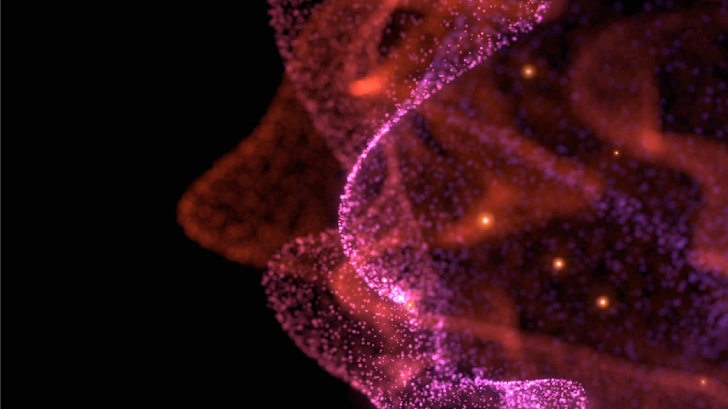
Rendered as a fluid, breathing mist of particles with a gravitational centre, it expresses the pull culture exerts on all of us. The glowing orbs within it are the passions, interests and moments that shape a person's world.
Relevancy is the art of placing brands inside that field. Connecting them to the cultural forces people already love, so they're drawn into orbit rather than pushed into view.
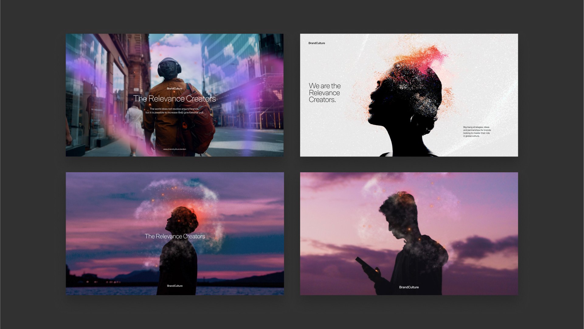
The cloud appears alone as the brand's signature device and swirls around individuals in photography — particles flowing around the contours of the figure so that culture and person become one thing rather than two. It tells the agency's story in a single image: culture connects everyone, and BrandCulture connects brands to culture.
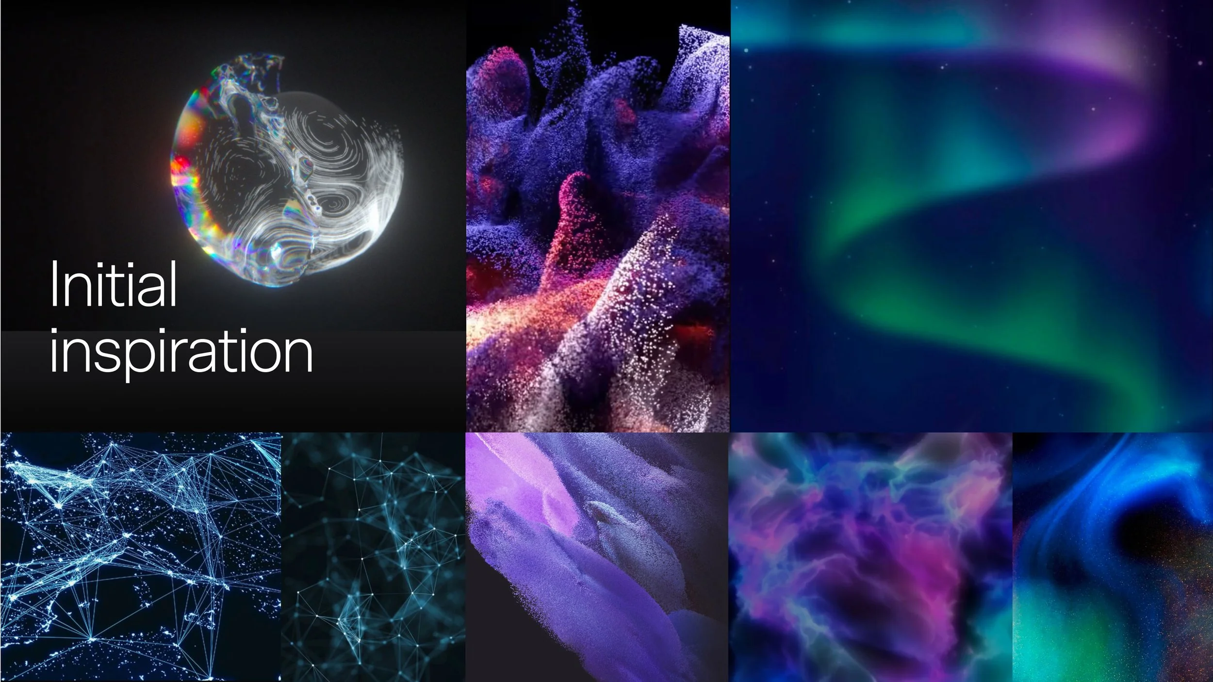
THE inspiration:The references came from systems too large to hold in one view. The aurora borealis, cosmic dust, complex particle systems — phenomena that behave with structure while appearing to move at random.
That was the tension the identity needed. Complexity that wasn’t chaotic. Colour that exists from somewhere beyond the everyday, holding its shape as it moves.
The Exploration:The references gave a feeling. The next question was what shape it took.
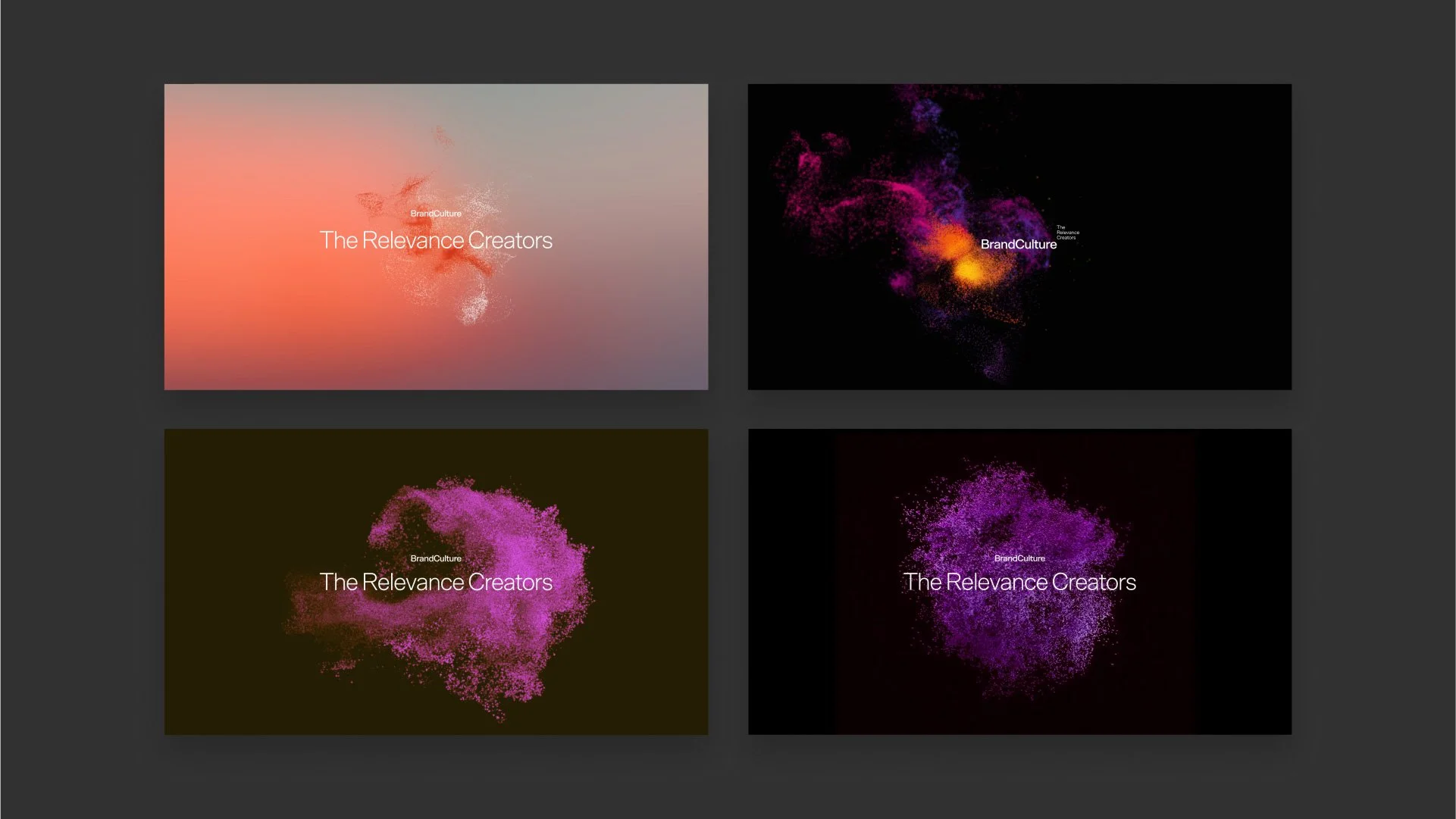
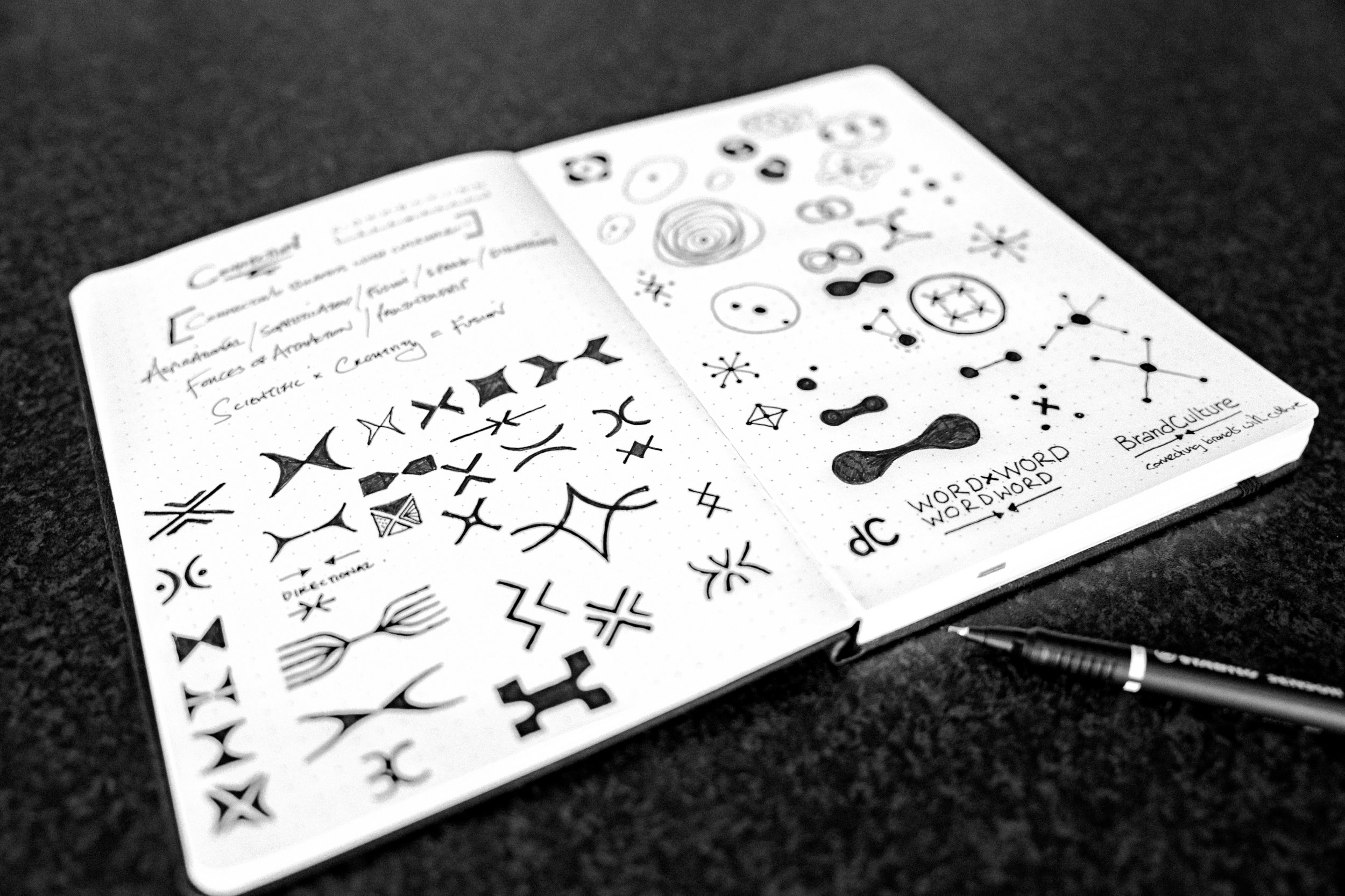
Initial ideas pushed the particles in different directions — dense, dispersed, orbiting a centre, drifting without one. Tested alone, behind type, and wrapped around individuals.
What carried through was gravity.
The LOGO:Two Words, One Idea.
Fusing the scientific with the creative, two expressions coming together to build new connections and ignite ideas in a shifting cultural universe. Its restraint is the point: minimal enough to carry partnership and innovation without stating them.
The resolution came from the name itself. Brand and Culture, drawn together as a wordmark and closing the gap between the two.
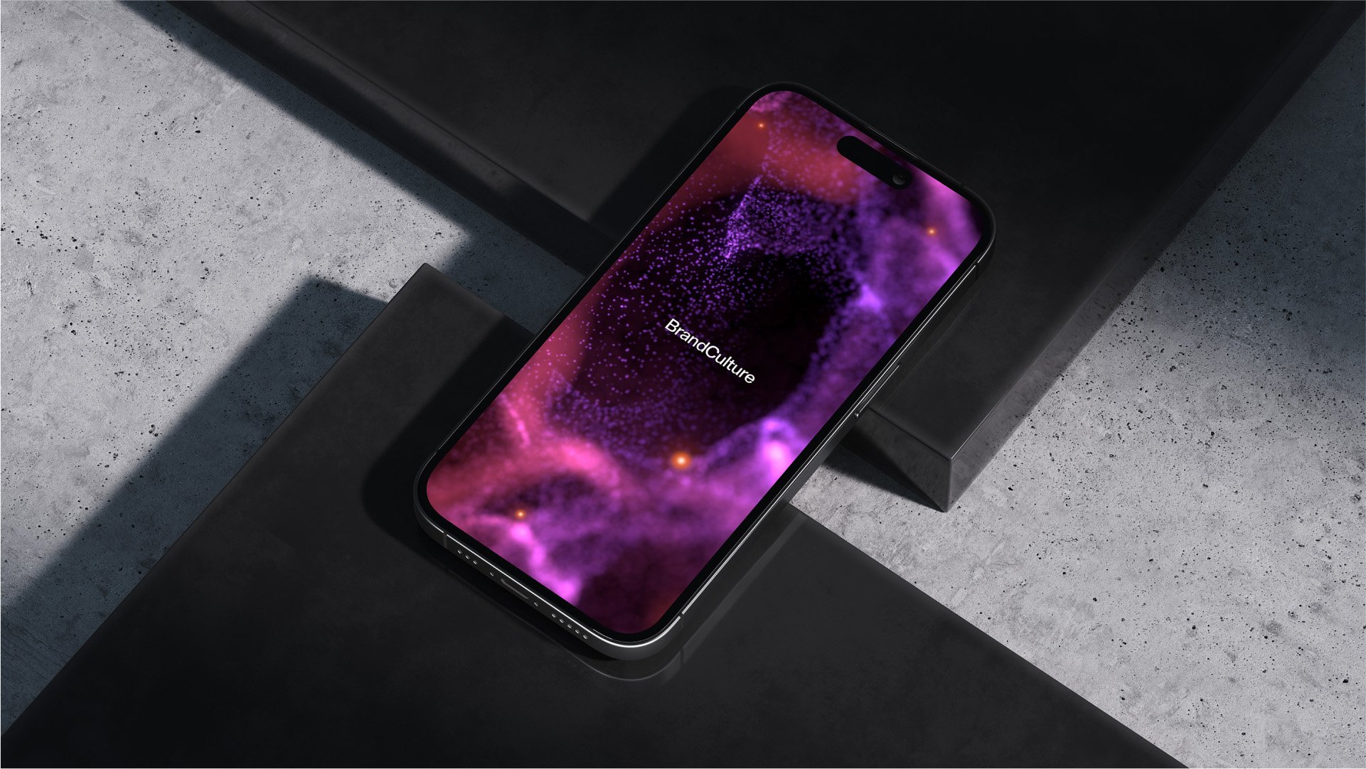
The Colour Palette:Celestial hues set against black, white and grey, blended through a subtle gradient.
The split is the strategy. The cosmic palette carries culture — fast-moving, expansive, hard to pin down. The neutrals carry commerce, whilst the precision behind work measured in growth and return. Blended, they became one system rather than two halves, which is the argument the whole identity is making.
The Typography:A primary sans-serif, applied with space around it. The confidence comes as much from the application as the typeface, letting the type breathe creates the sophistication and precision the strategic work demands.
It sits understated in minimalist layouts and turns striking when paired with the graphic system. Restraint from the type, energy from the visuals: the same balance running through everything else.
The Imagery:Individuals in the environments of ordinary life. The locations and contexts aren't a backdrop, they carry meaning and give each frame something to say.
Most subjects are captured mid-thought rather than performing, offering a window into their inner experience rather than posed. The casting is deliberately broad across age and background as culture isn't a demographic, and the imagery shouldn't suggest it is.
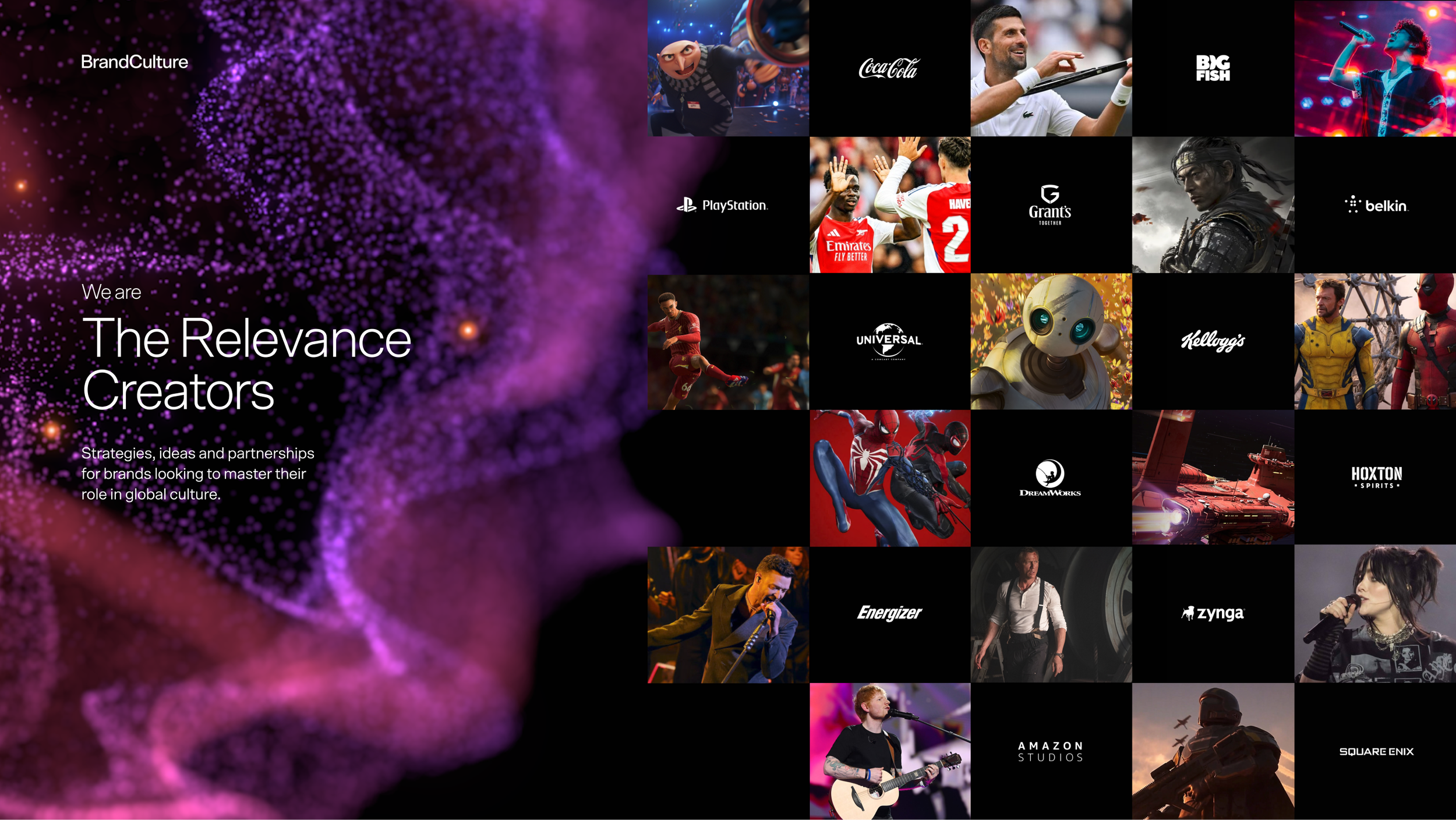
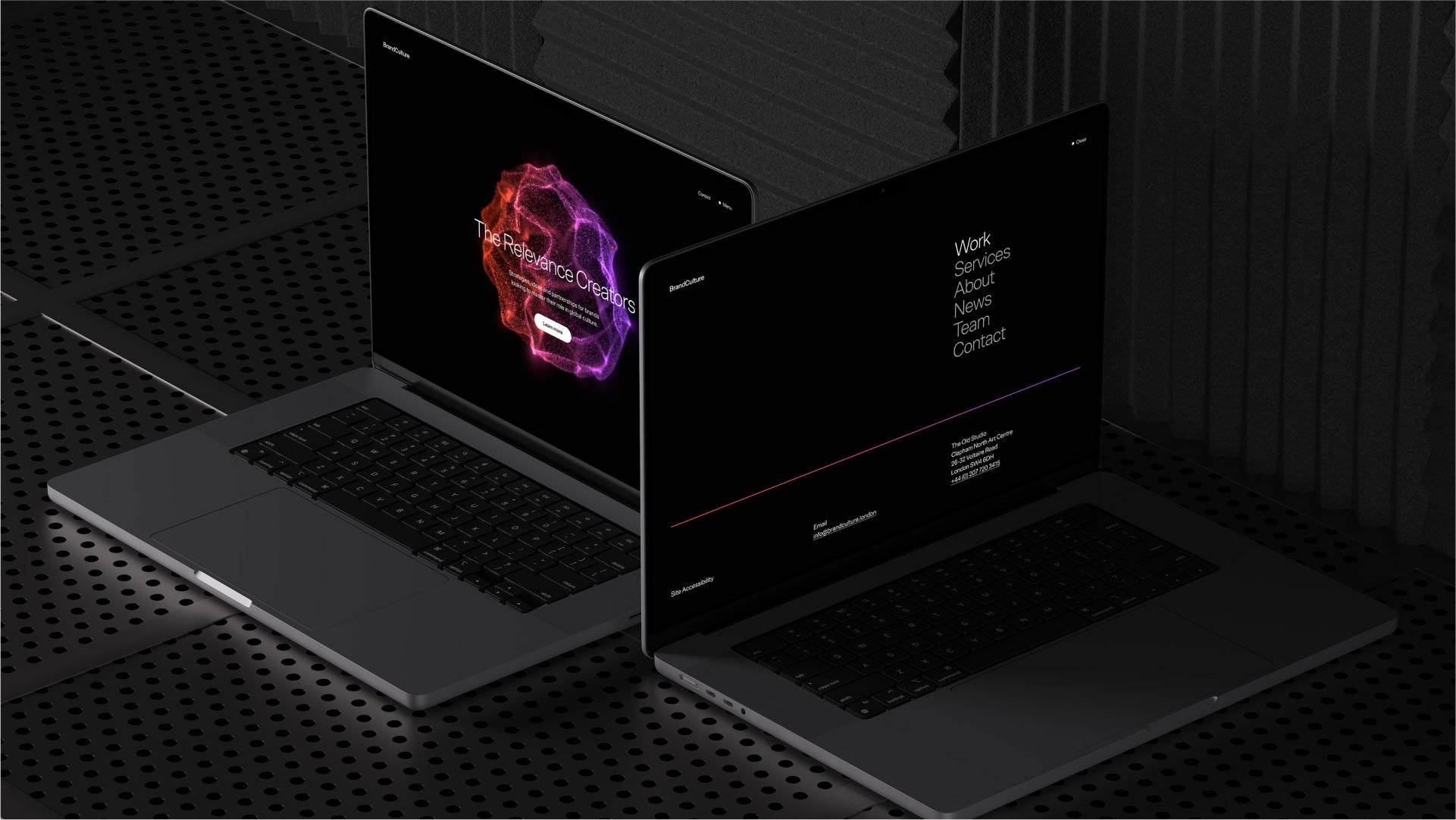
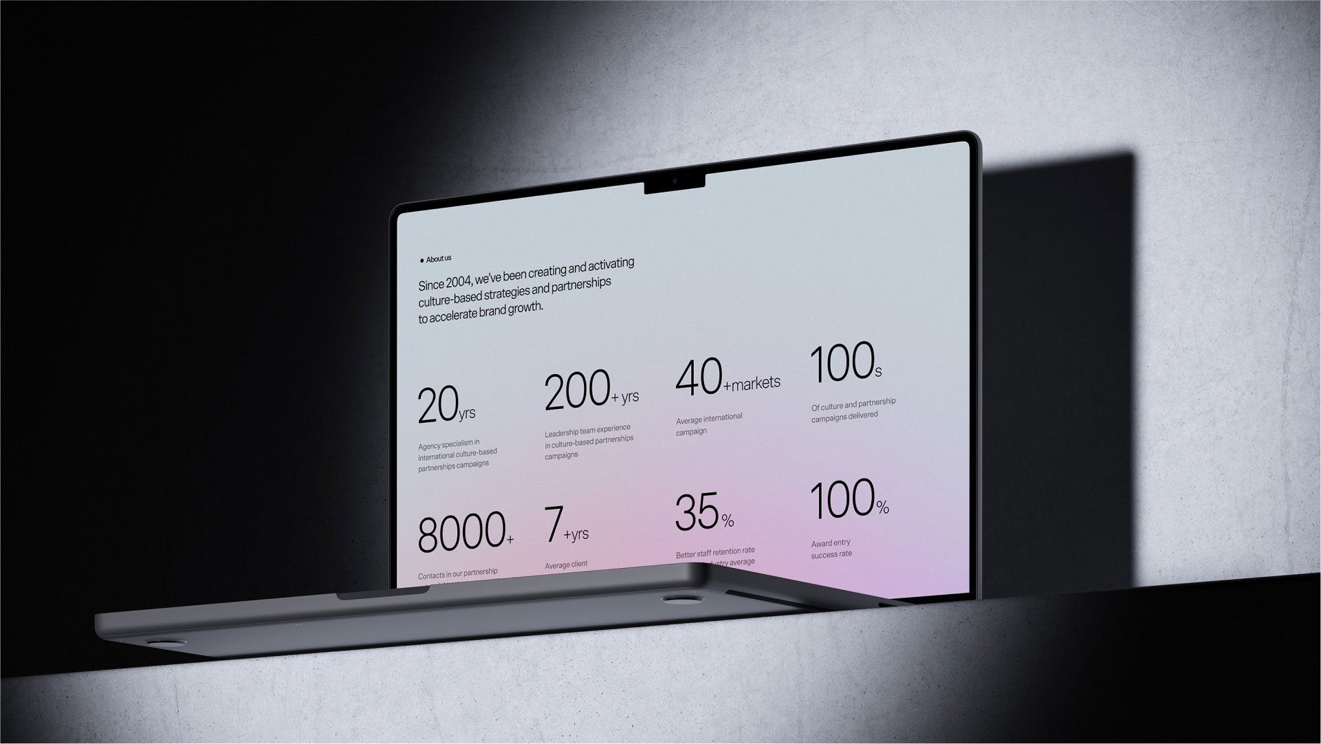
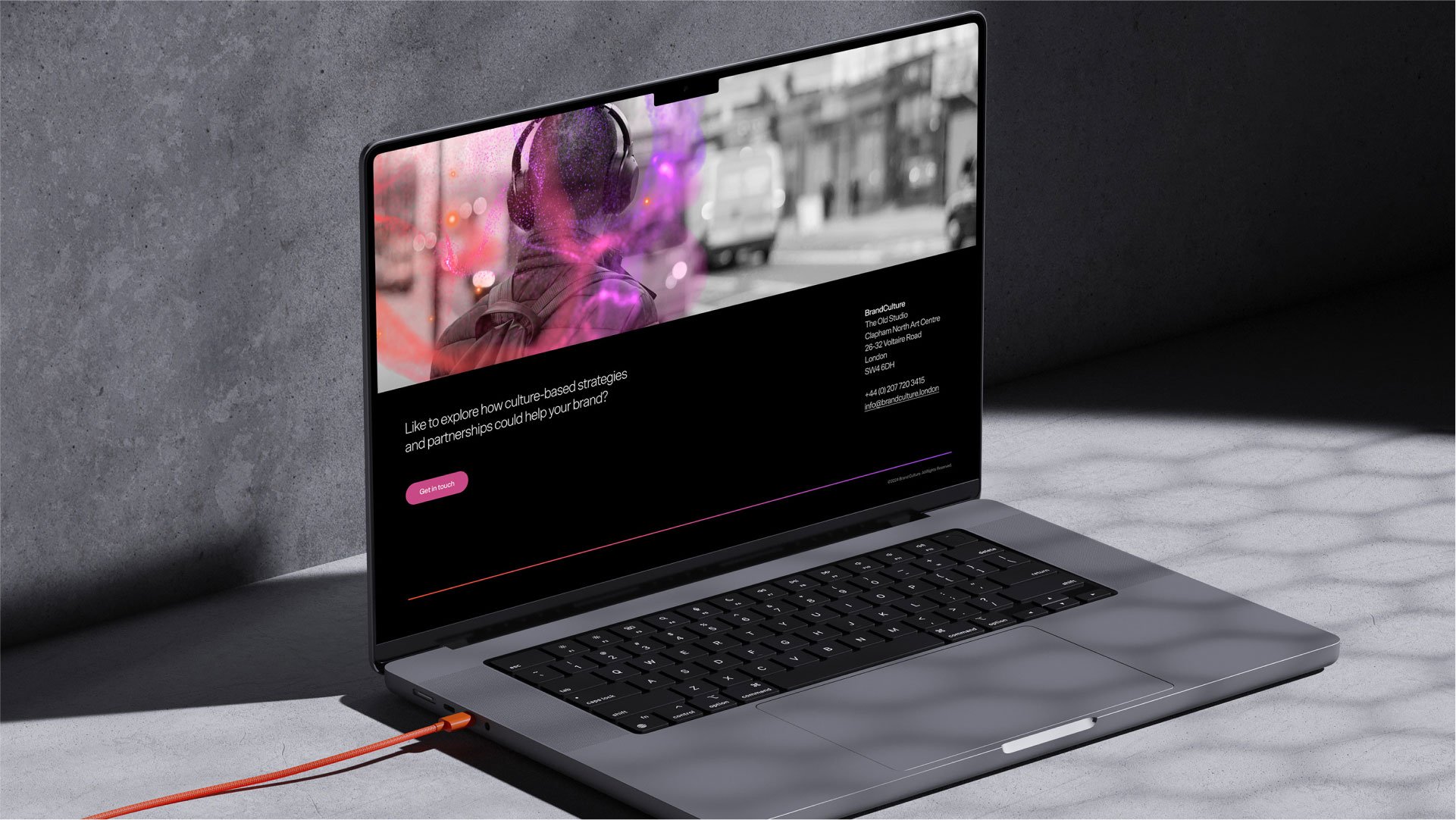
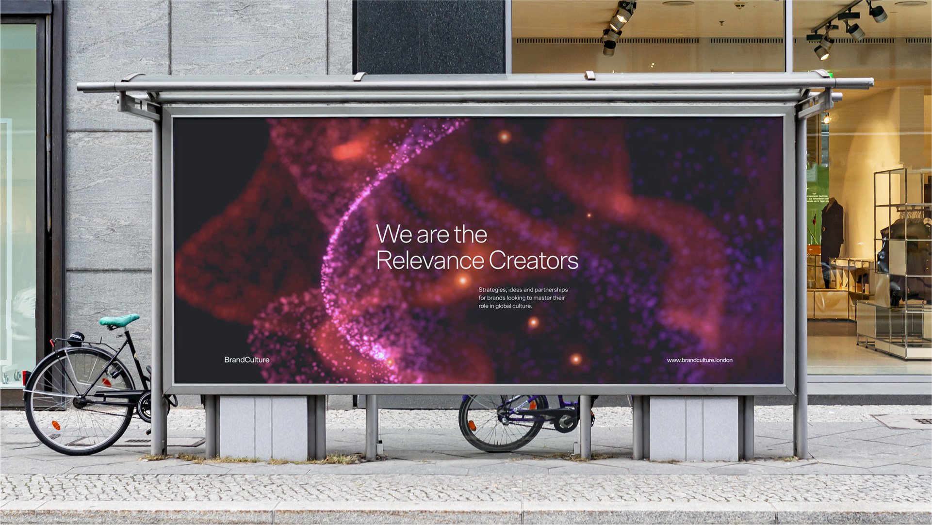
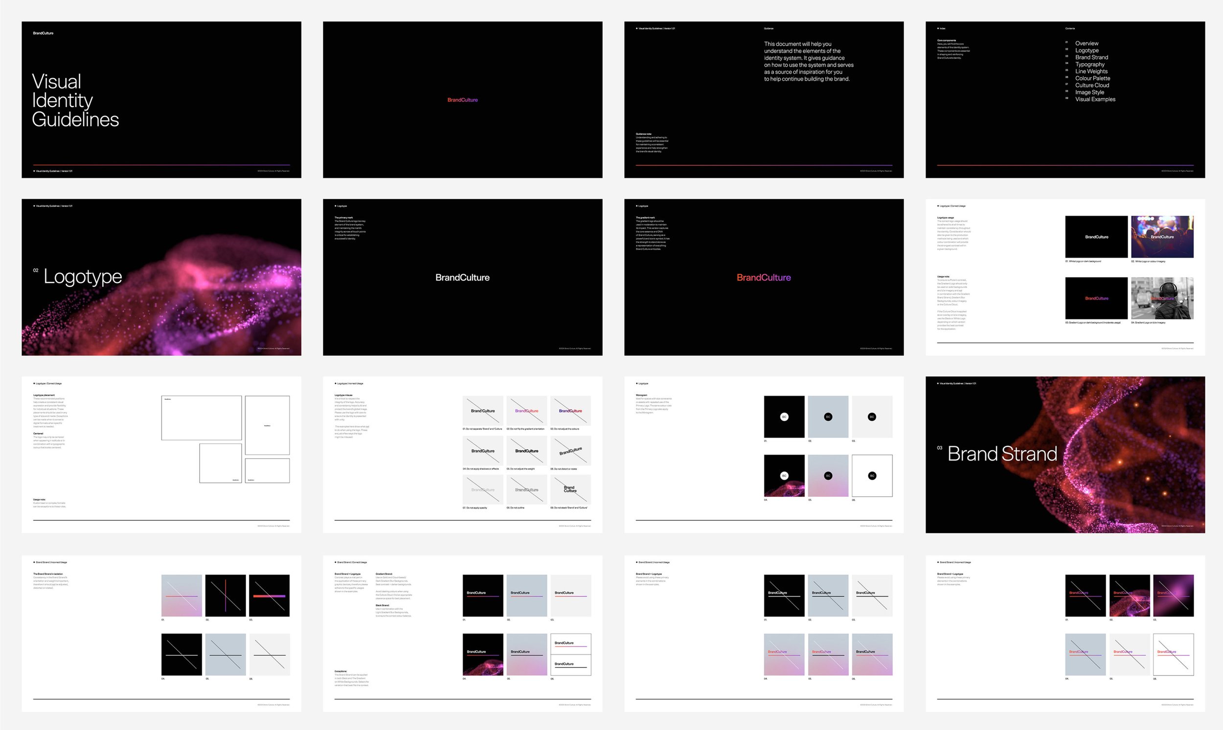
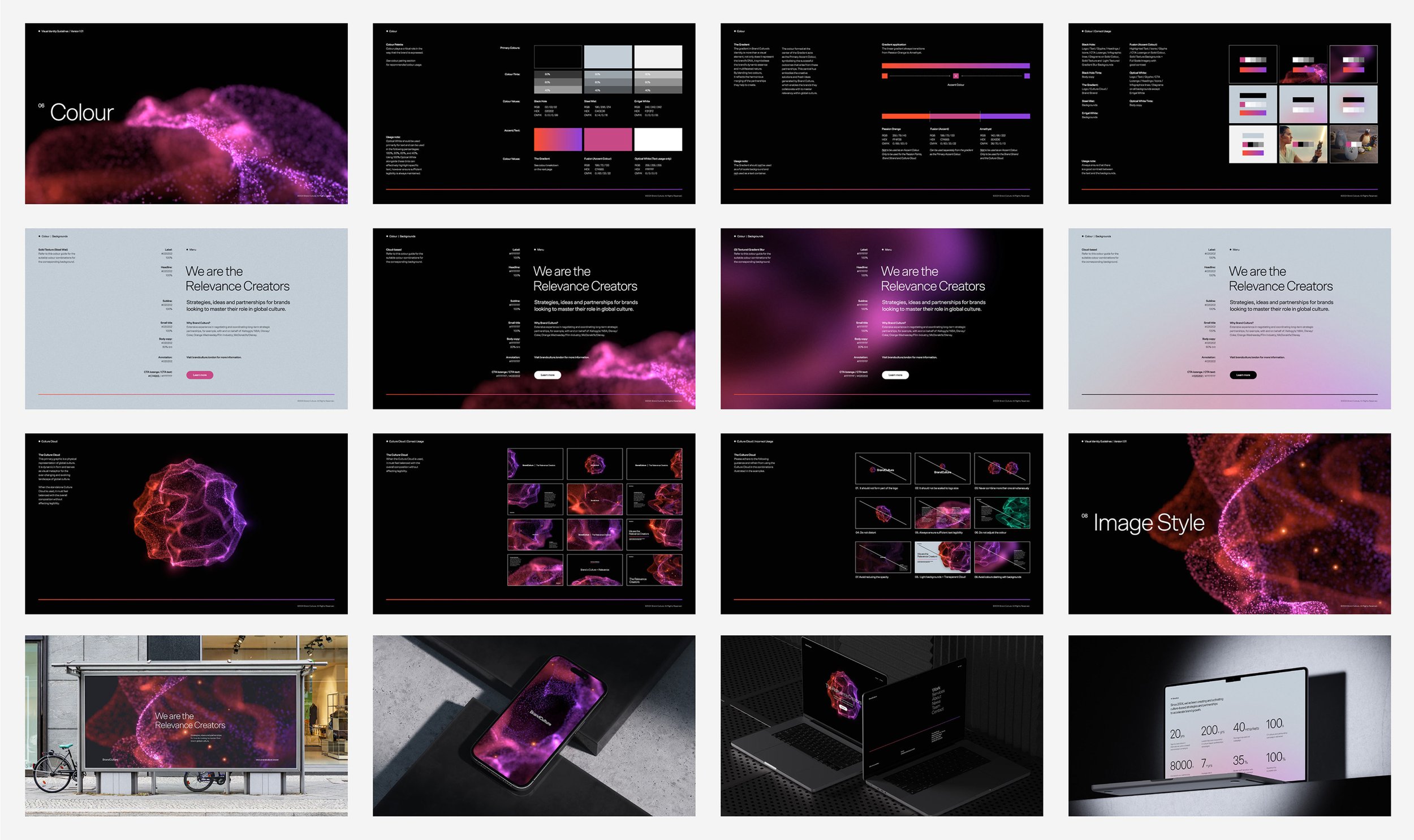
The OUTCOME:An identity that holds rigour and invention in the same frame, interpreted across every touchpoint — from the signature device to individuals immersed in the cloud itself.
Twenty years of partnering brands with culture, finally given a form that shows the full breadth of it.
Relevancy, made visible.