
Inflow-Studio
A creative practice exploring raw and experimental work that lives in the in-between - between photography, art and visual design, where process becomes form.
Project:
Brand IDENTITY/
Development
Role:
STRATEGY/
Art Direction/
Design/
PHOTOGRAPHYProject Overview:Inflow-Studio is a self-initiated creative practice. Photography, art and visual design, all under one name, made by one mind and inspired by many.
It runs alongside client work, not instead of it. Briefs come with constraints. This is a space where creativity can be expressed beyond them, and where my own thinking, taste and style can stay sharp.
Flow lives in the between state. The pocket of focus where thought falls away and pure expression and creativity comes through.
That became the structure. Every element of the practice built as two opposites. The space between them is where everything is made.
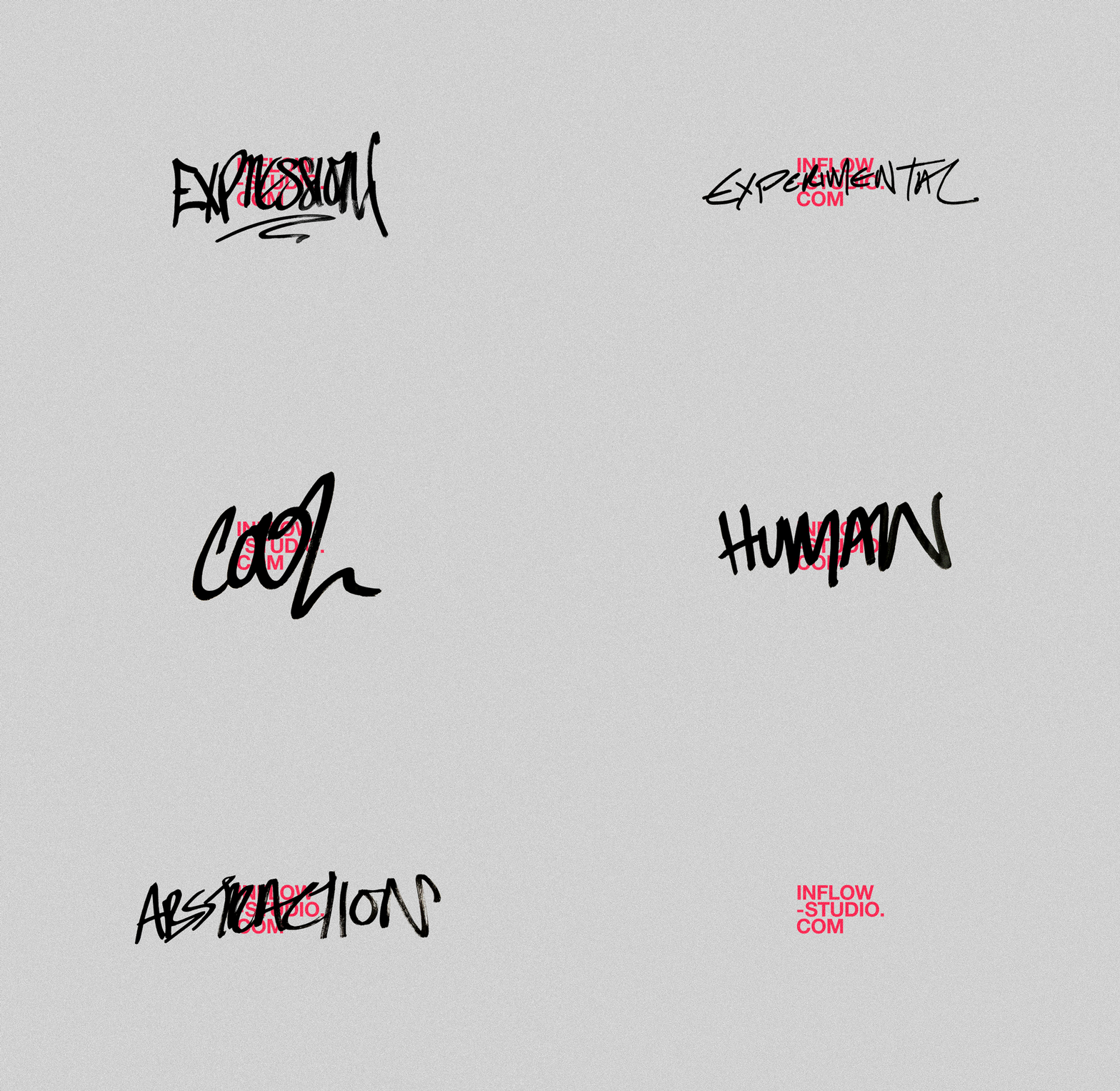
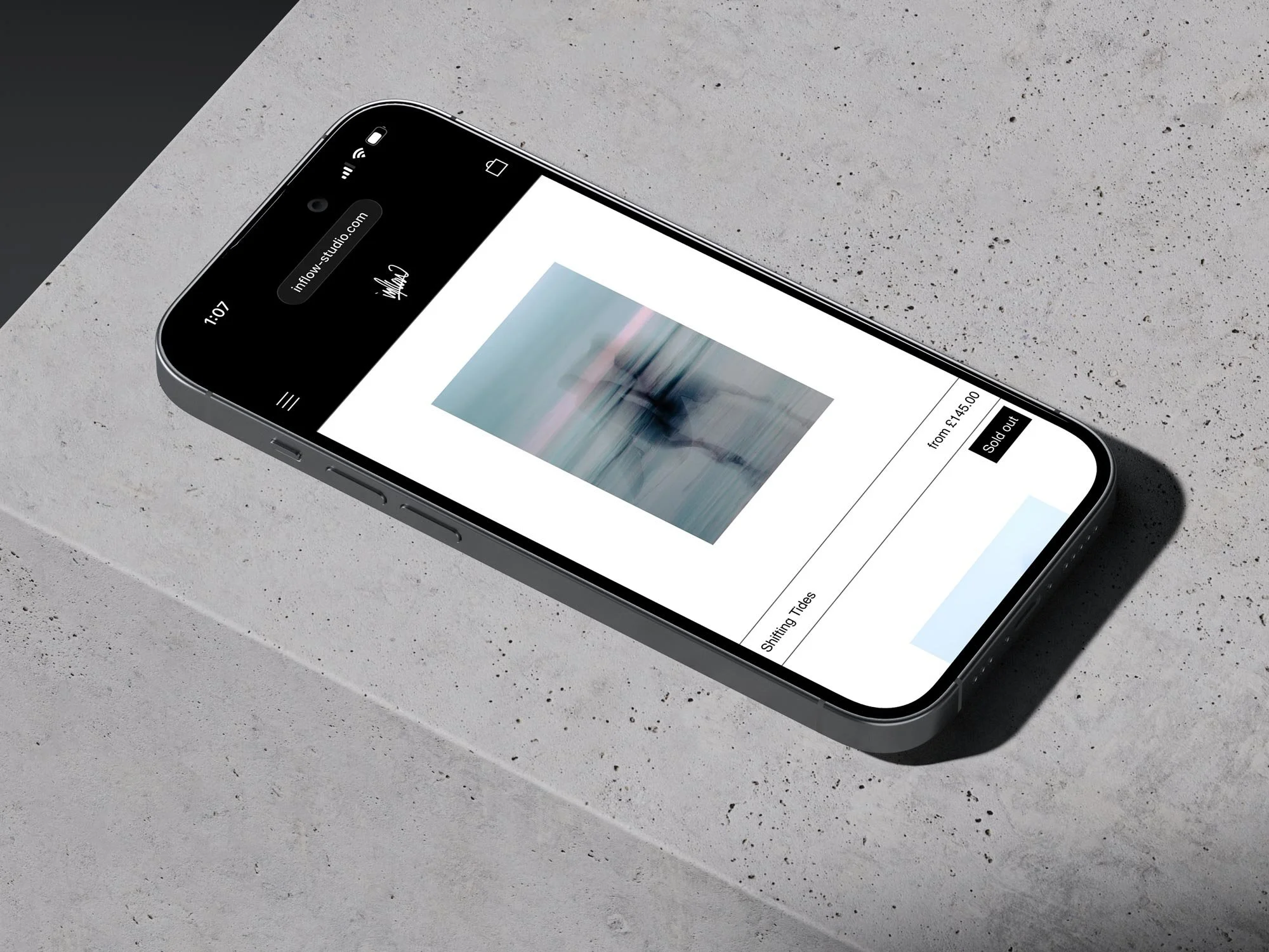
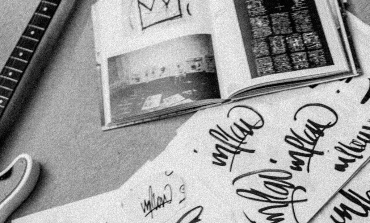
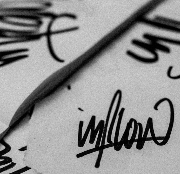
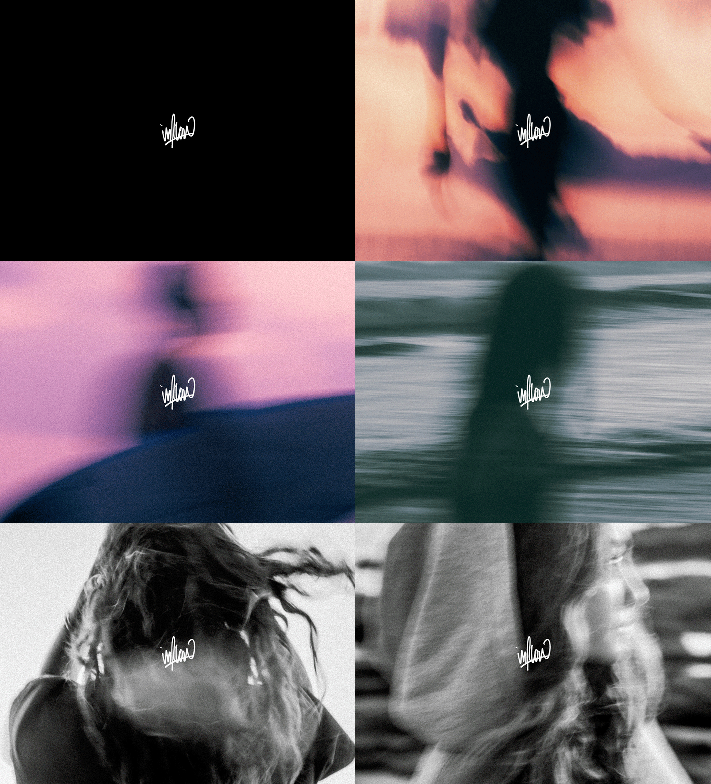
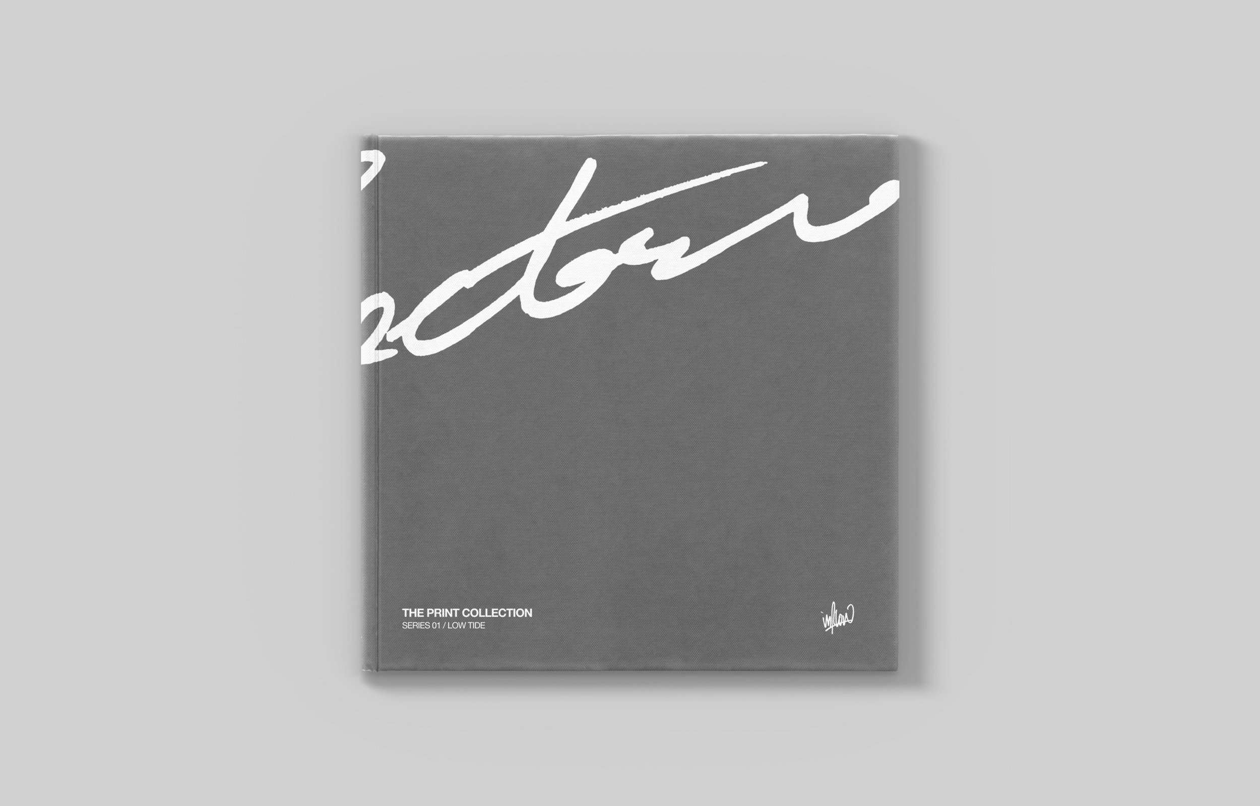
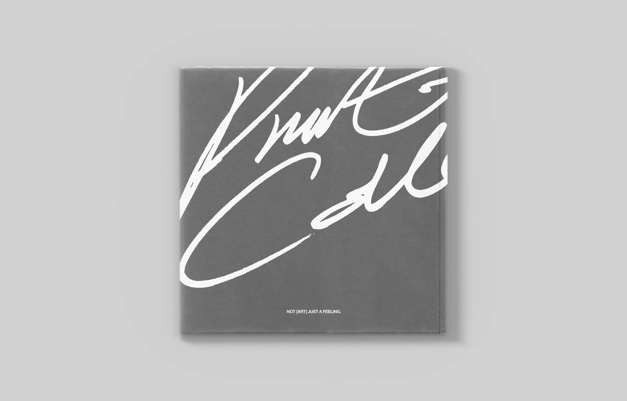
THE MARKHand drawn. Raw, real and human. It acts as a signature. Less a logo than a mark of authorship. Made in the moment.
Alongside it, a typeset lockup carrying the domain. The mark signs the work. The lockup points to it. One by hand, one by design.
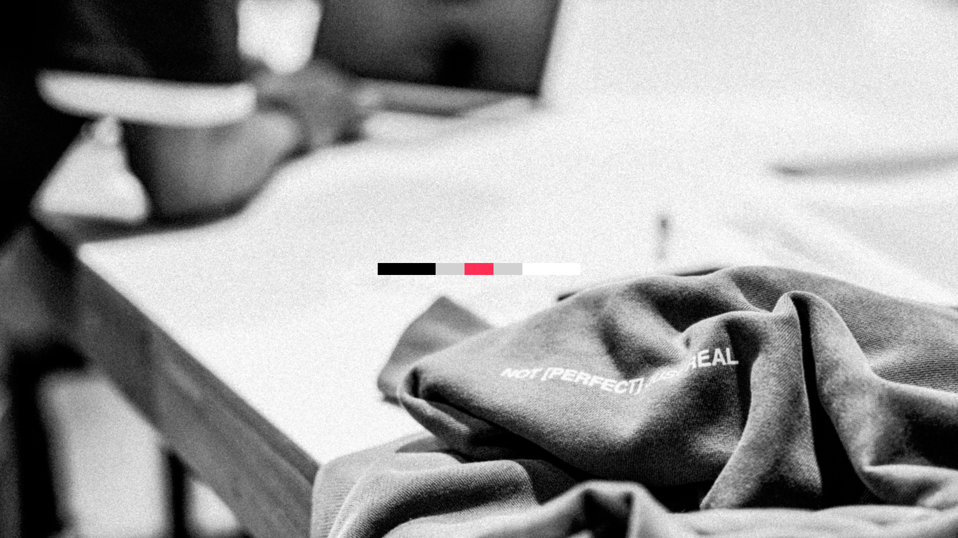
THE colour paletteBlack and white are the opposites. Grey is the space between them. Red is the spark and what comes through. Used sparingly, and always intentional when applied.
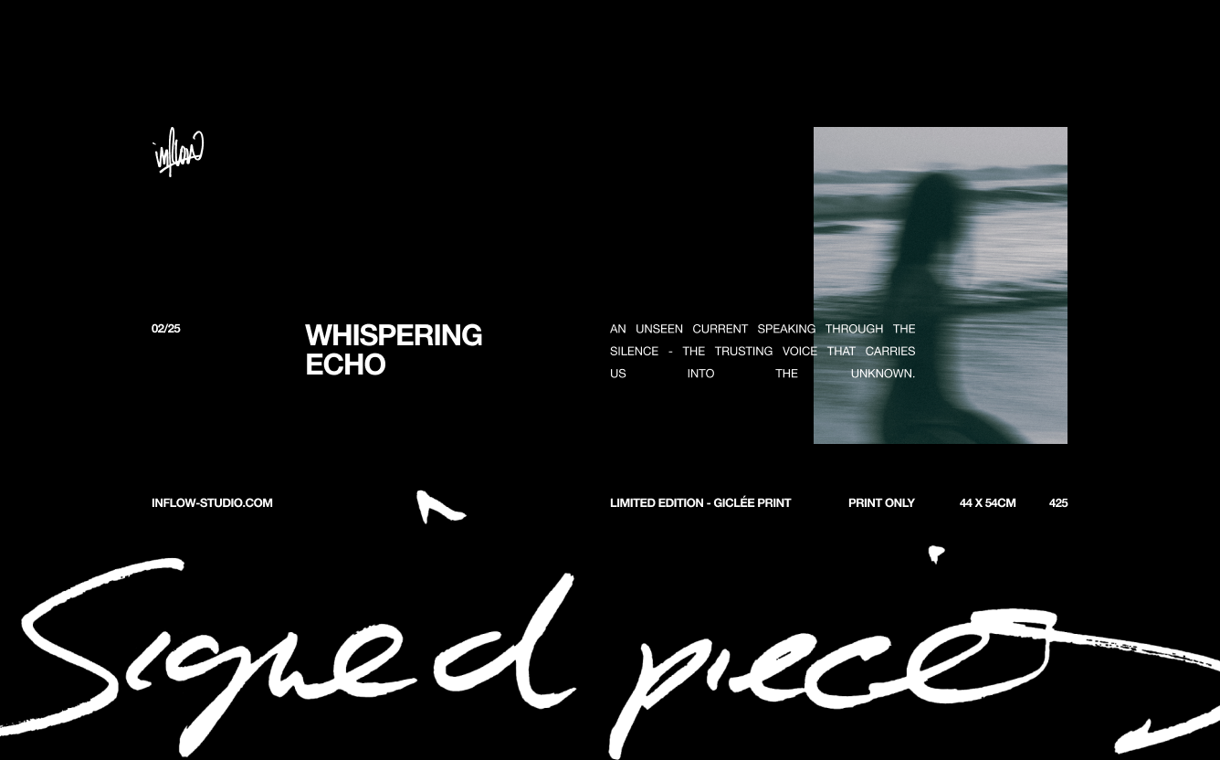
The TYPOGRAPHY:Helvetica and the handwritten word. One fixed, one unrepeatable.
Helvetica was chosen for its restraint. It states the detail and steps back, letting the work speak. The handwritten word is the opposite. Fast, loose, made in the moment, with the same flair as the mark.
Structured frame-wise, copy justified inside it. Form holds. Expression moves.
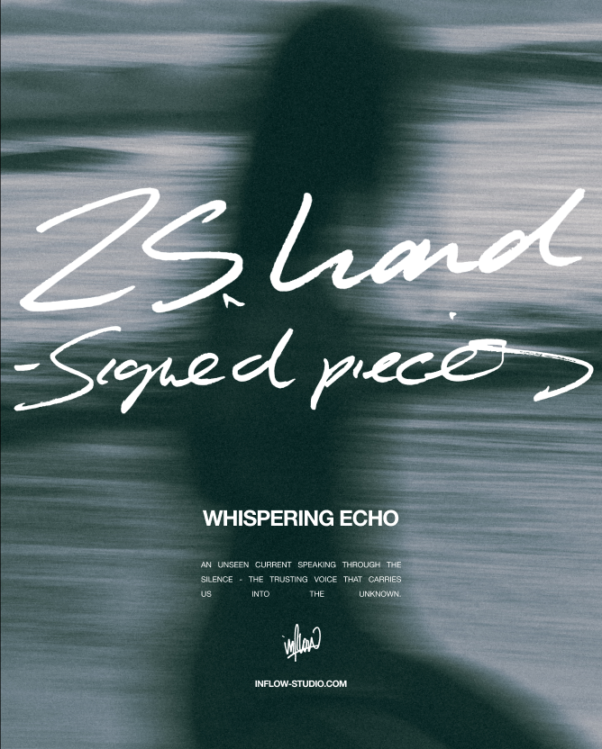
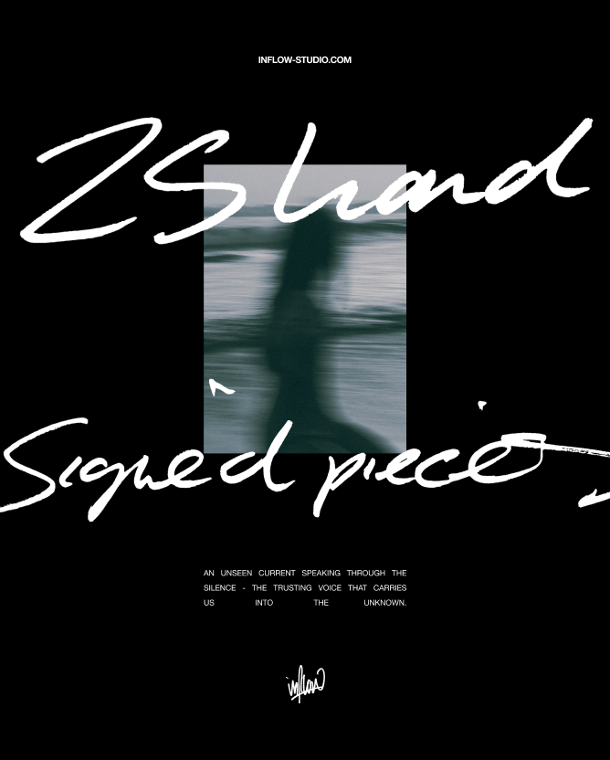
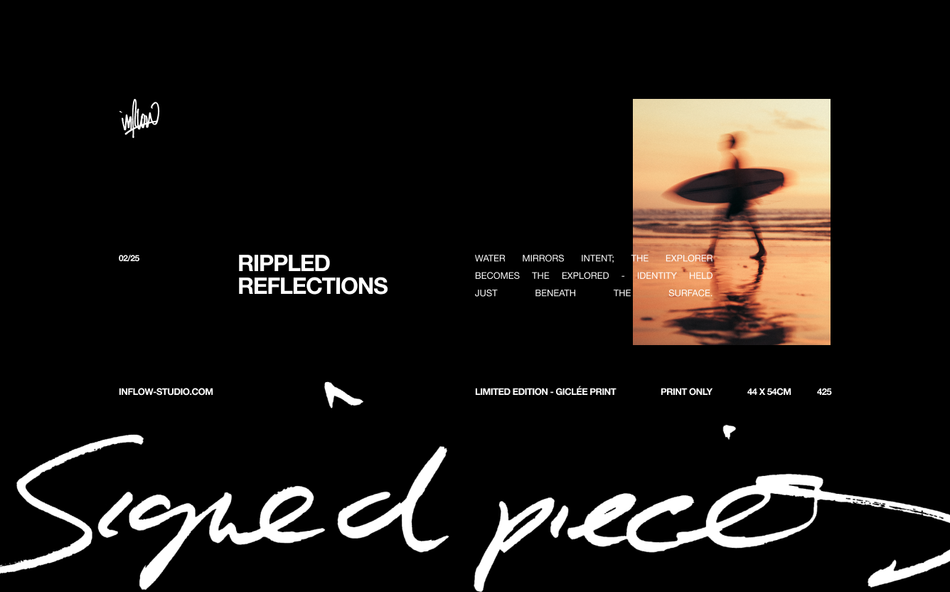
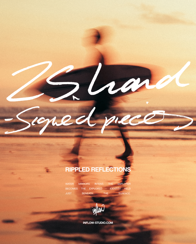
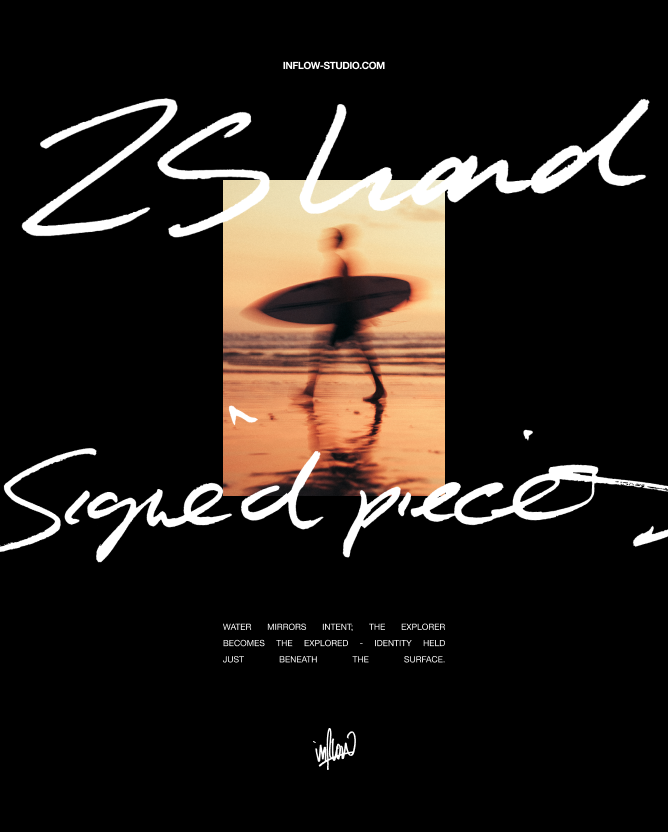
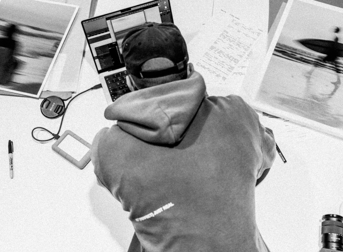
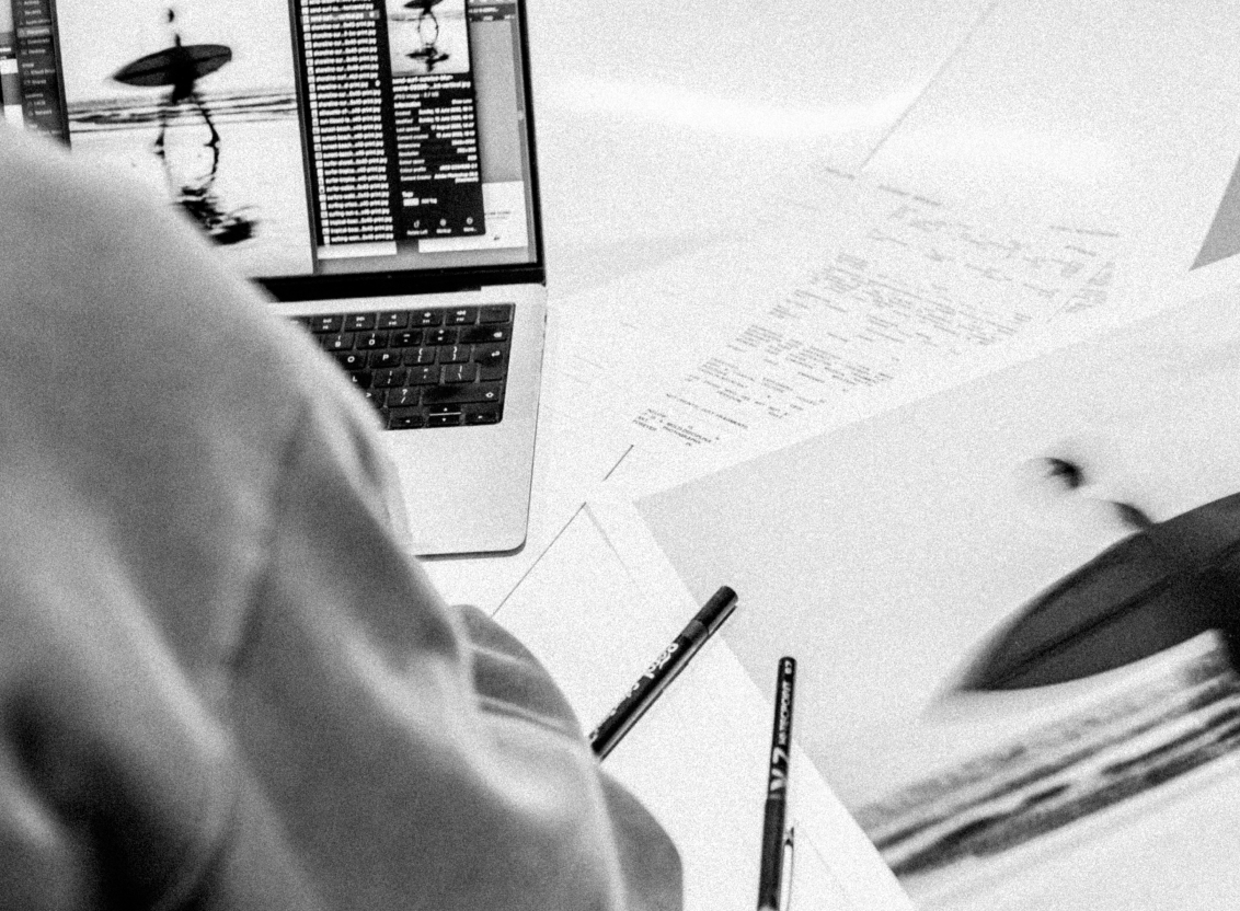
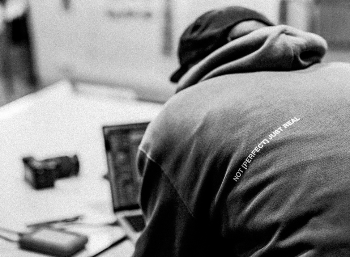
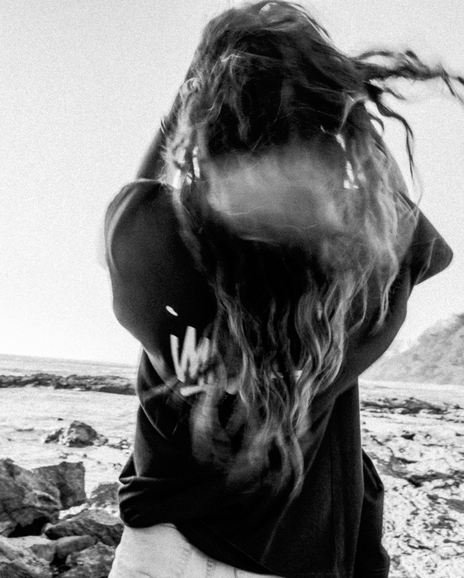
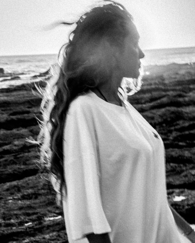
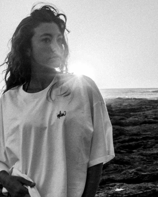
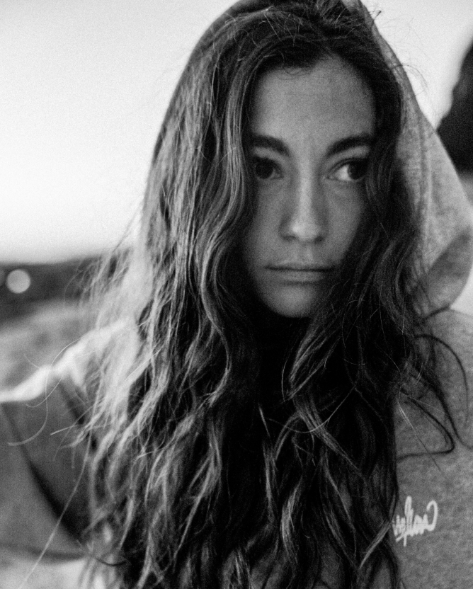
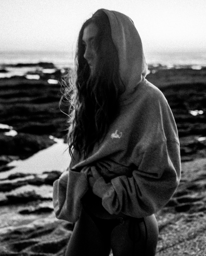
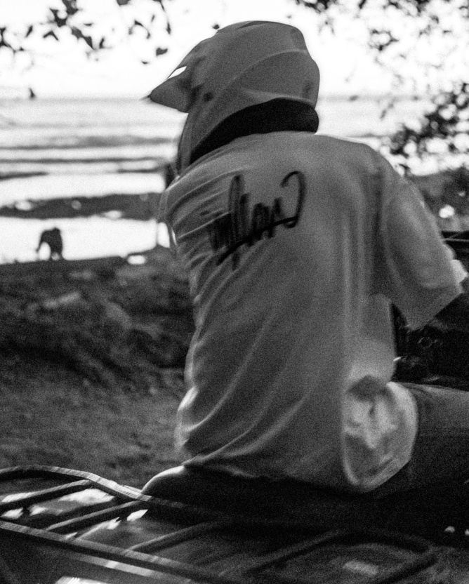
The Two States:The work represented primarily in colour. The process documented in black and white. One is what it became, the other is how it happened.
The process is not a supporting act. It runs alongside everything.
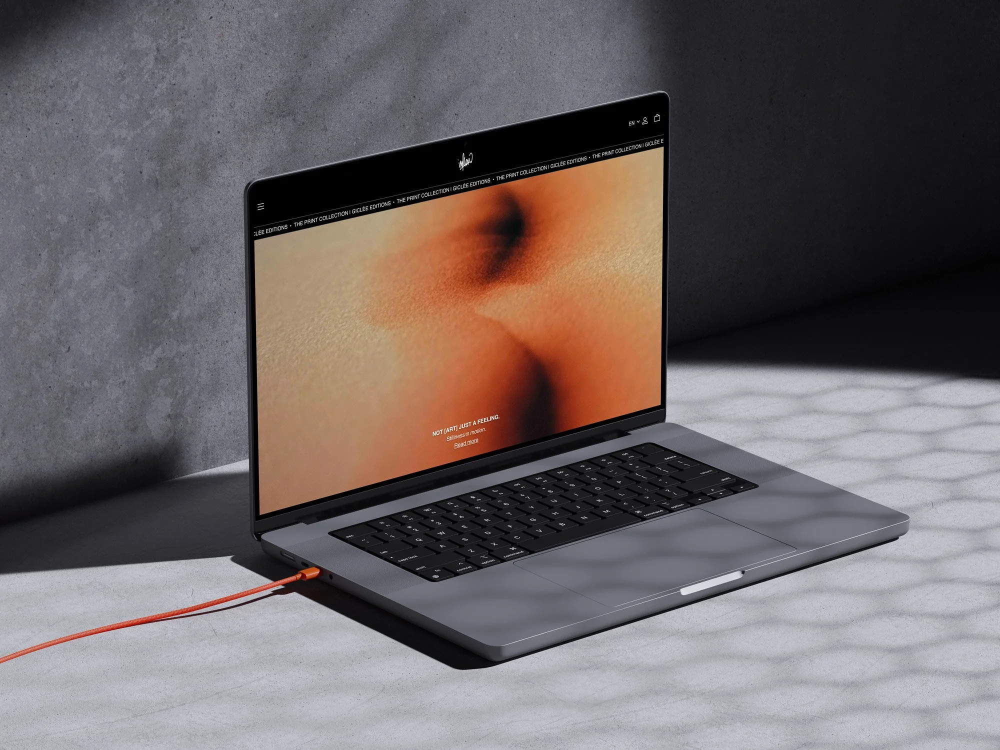
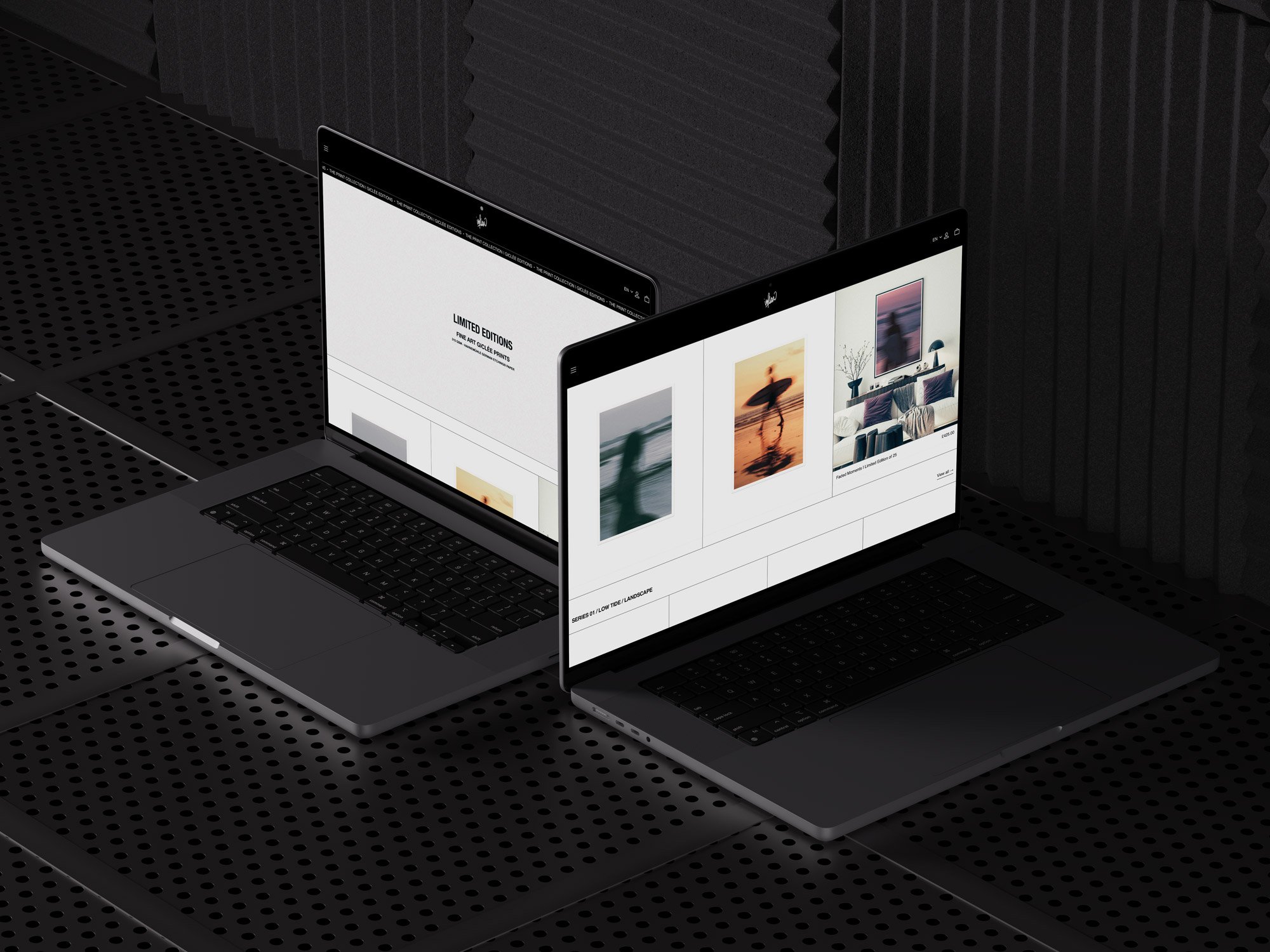
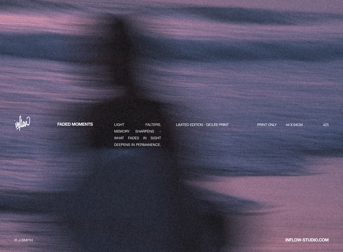
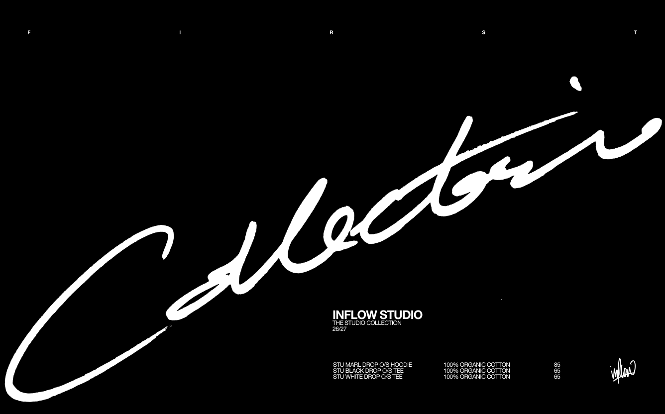
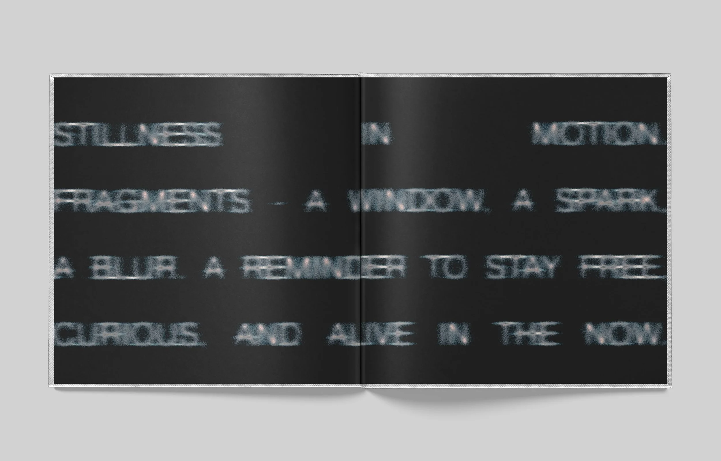
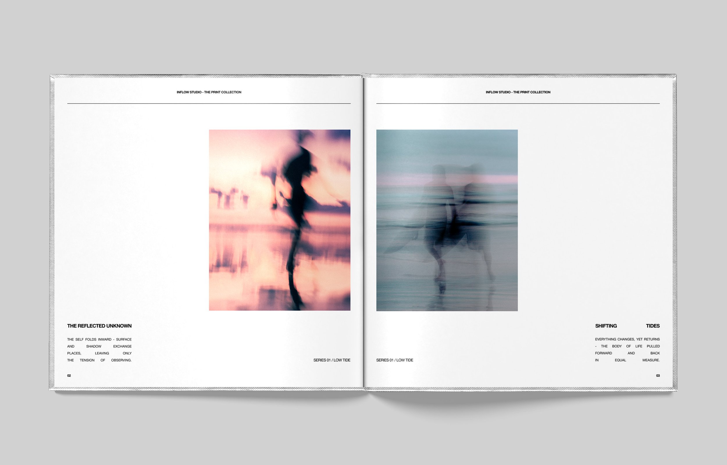
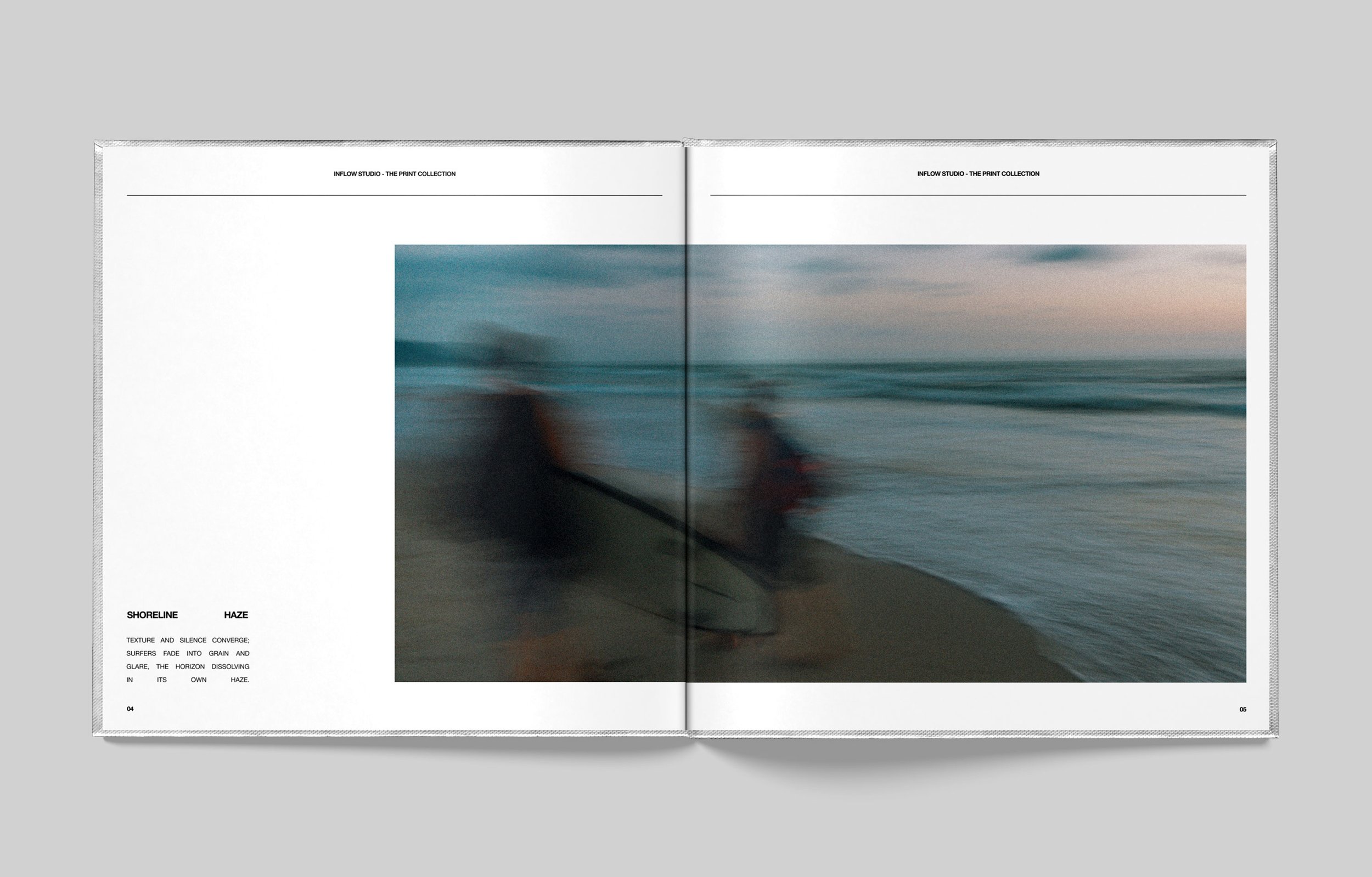
THE FIRST COLLECTION:The first collection began as a feeling rather than an idea. The concept revealed itself in the making. Stillness in motion.
The collection was made in a place where the ocean meets the jungle. The idea for the studio came out of being there. The work came first, and the practice was built around it afterwards.
Alongside the photography, three pieces followed. A black tee, a white tee and a grey hoodie. The primary palette, worn. Made for the studio and made to work in. A limited release, three pieces, no more.
Shot in the same place, a year later.
the FRAMEA language of duality, held in a frame.
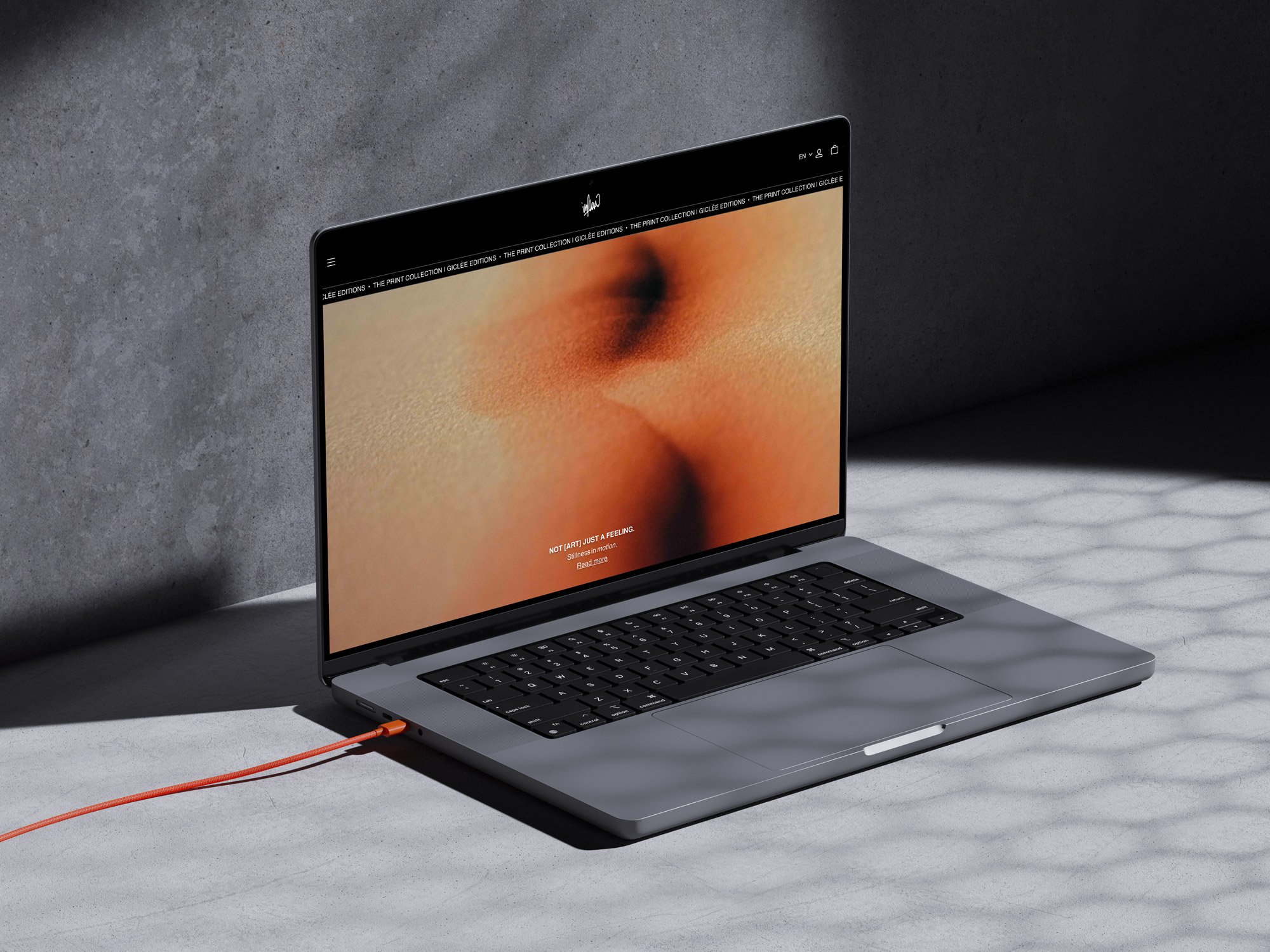
The bracket holds the label. What follows sits outside it, plainly stated. The two sit in tension. Surface against essence, and the gap between them.
NOT [ART] JUST A FEELING.
The structure is fixed. The contents change. One frame with endless variations.
Always framed. Always alive.
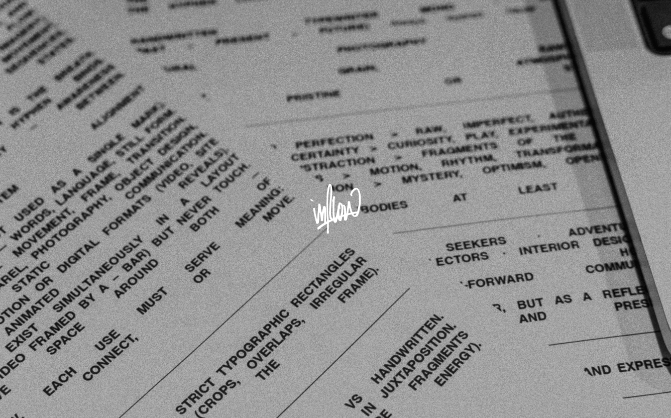
THE IN-BETWEEN:The constraints come from the work, not from a brief. Concepts reveal themselves and worlds are built around them. The in-between is where that happens, and it stays open for whatever comes next.
Enough structure, so creativity can breathe.