
Soul Seed
Crafting the identity of a wellness brand rooted in clinical nutrition, adaptogen craft and community care - where evidence meets empathy and healing begins at the root.
Project:
reBrand
Role:
STRATEGY/
Creative Direction/
Art Direction/
DesignProject Overview:The brief was to build a brand identity from the ground up that could hold all of this - clinical authority and human warmth, scientific rigour and natural nourishment, local roots with big ambitions. An identity that spoke as clearly to someone walking past the cafe as it did to someone booking their first consultation or purchasing supplements in store or online.
The identity needed to communicate one thing above everything else: this is healthcare that actually works, and you are in the right hands.
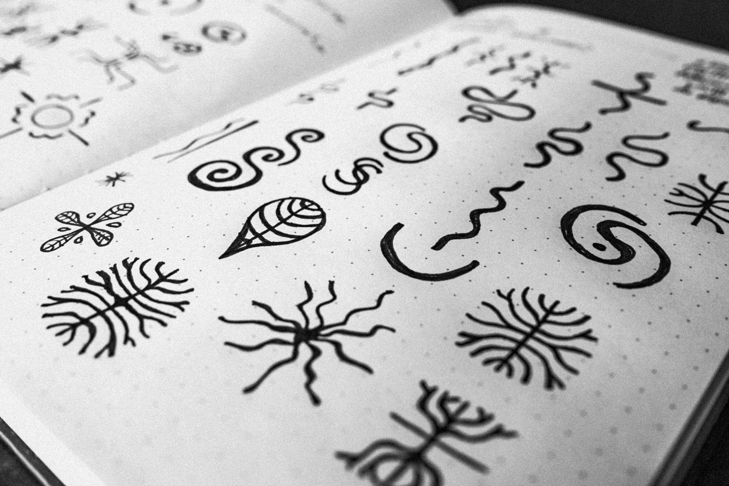
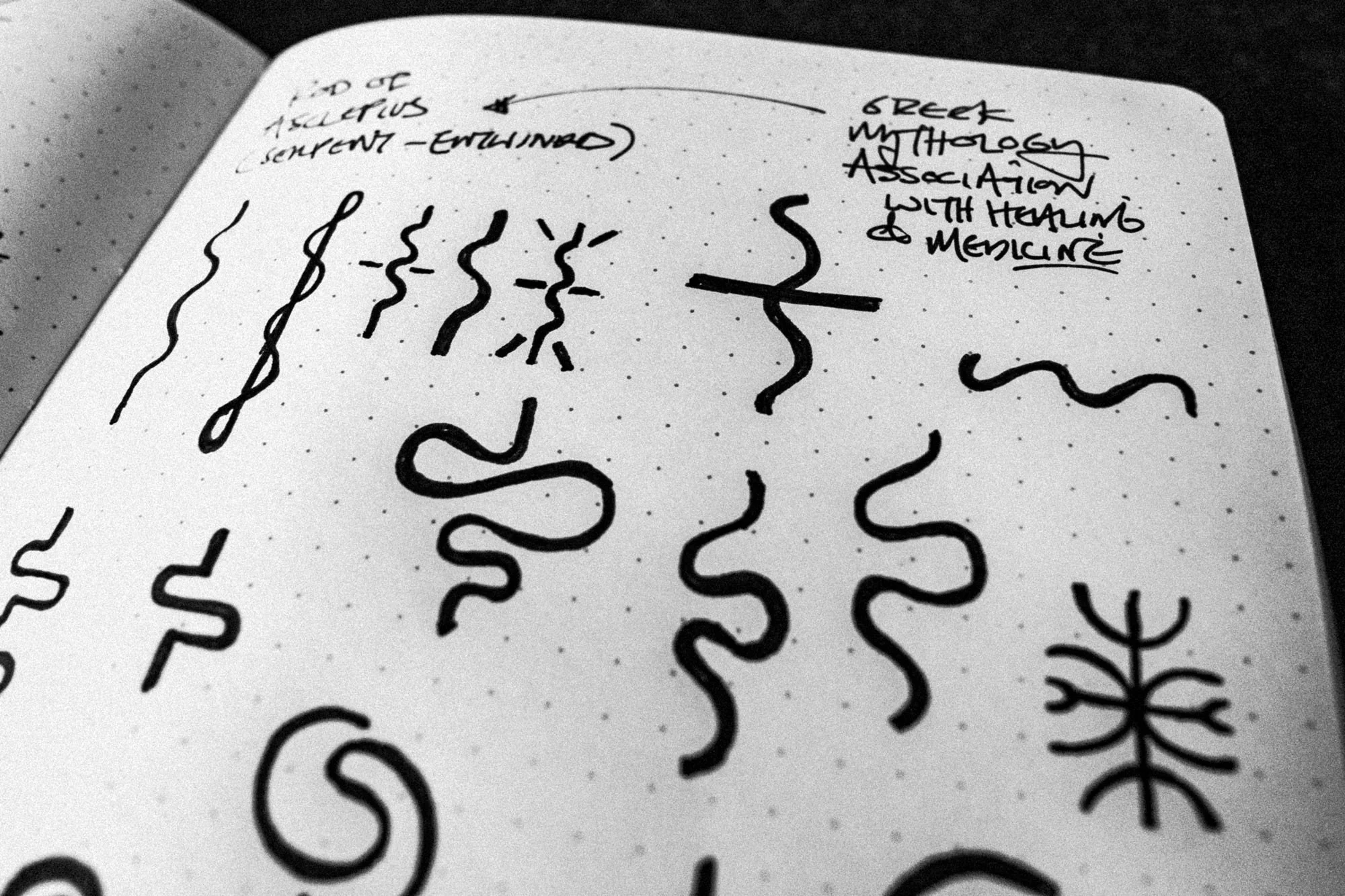
THE LOGOAt the heart of the identity is device that is inspired by nature's most intelligent networks - mycelium, root systems and the veins of a living body. It is a visual metaphor for everything the brand does - finding the root, understanding the connection, supporting the whole.
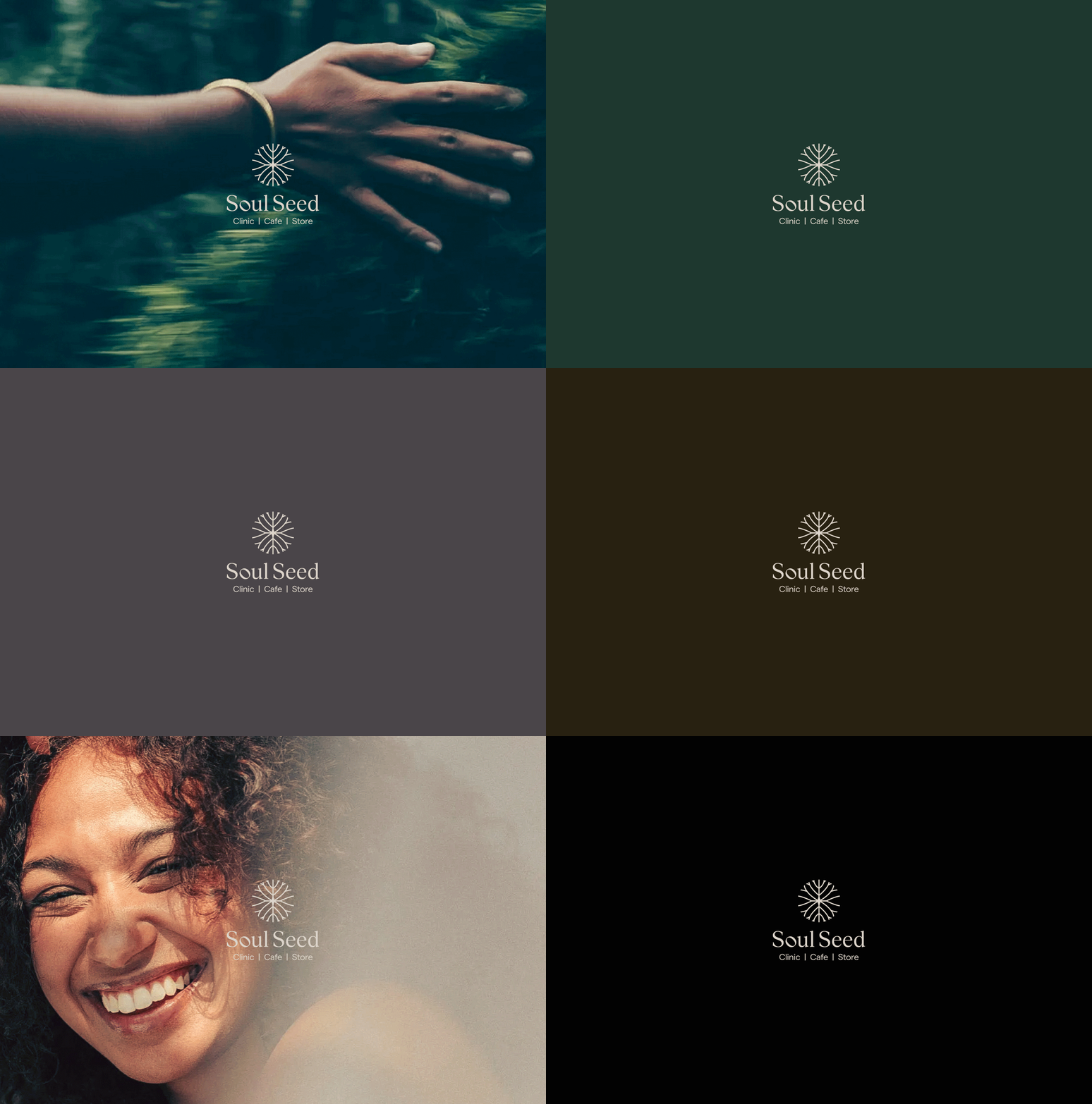
The 'o' in Soul Seed has been subtly modified - a deliberate imperfection in an otherwise precise wordmark. It speaks to the soul of the brand. Not everything about healing is clinical. There is a human side - one that understands, empathises and has lived the same journey. That side of Soul Seed lives within this single letter.
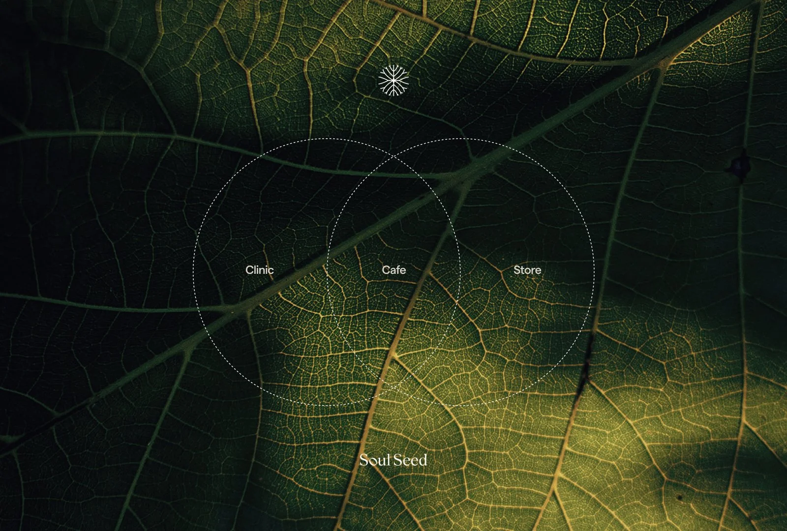
The eco-system that appears under the logo was a strategic design solution to a real problem. Soul Seed's name and mark were abstract prior to the rebrand - nobody knew what the brand was or what it did. By incorporating clinic, cafe and store beneath the primary and secondary logos, the brand communicated everything instantly. Who they are. What they do. All in one mark.

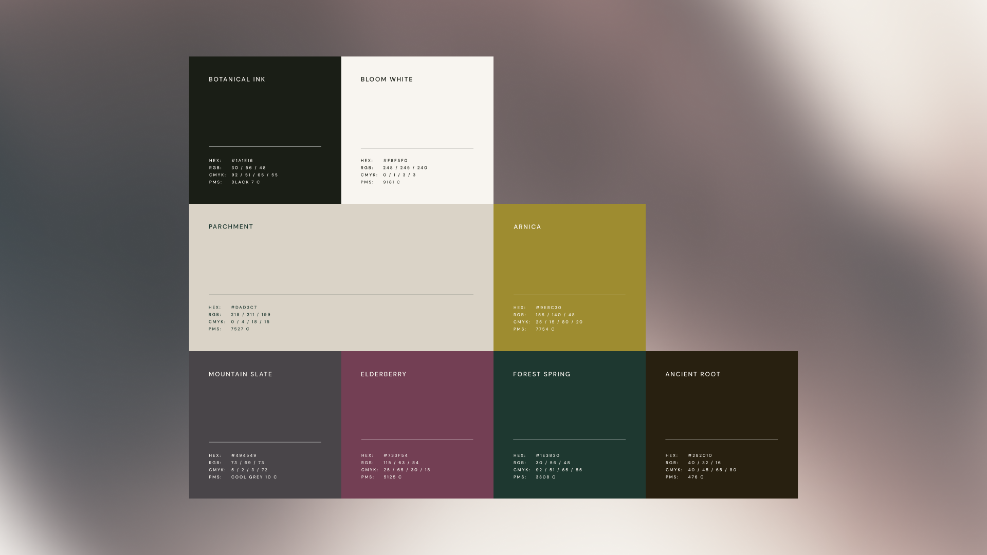
THE colour paletteInspired from the natural world - deep woodland greens, warm earth, stone, bark and parchment.
Arnica gold is used as a considered accent - the colour of vitality and warmth in nature. Gold has long represented life and something of value. Here it does the same - with restraint and purpose.
Together the palette speaks to what the brand is. Rooted. Considered. Alive.
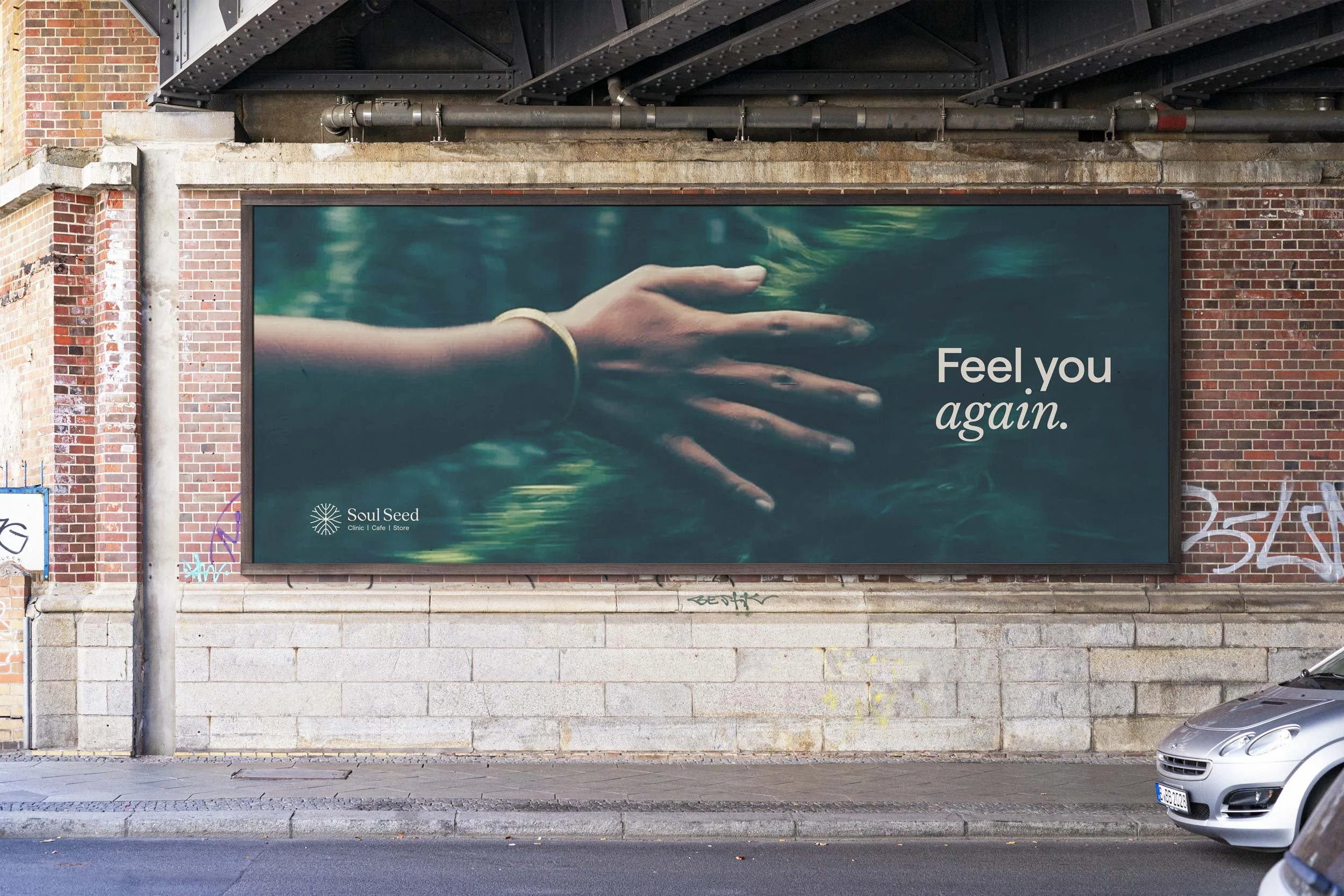
The MESSAGING:The messaging and typography reflects the dual nature of the brand - clinical authority alongside genuine human warmth.
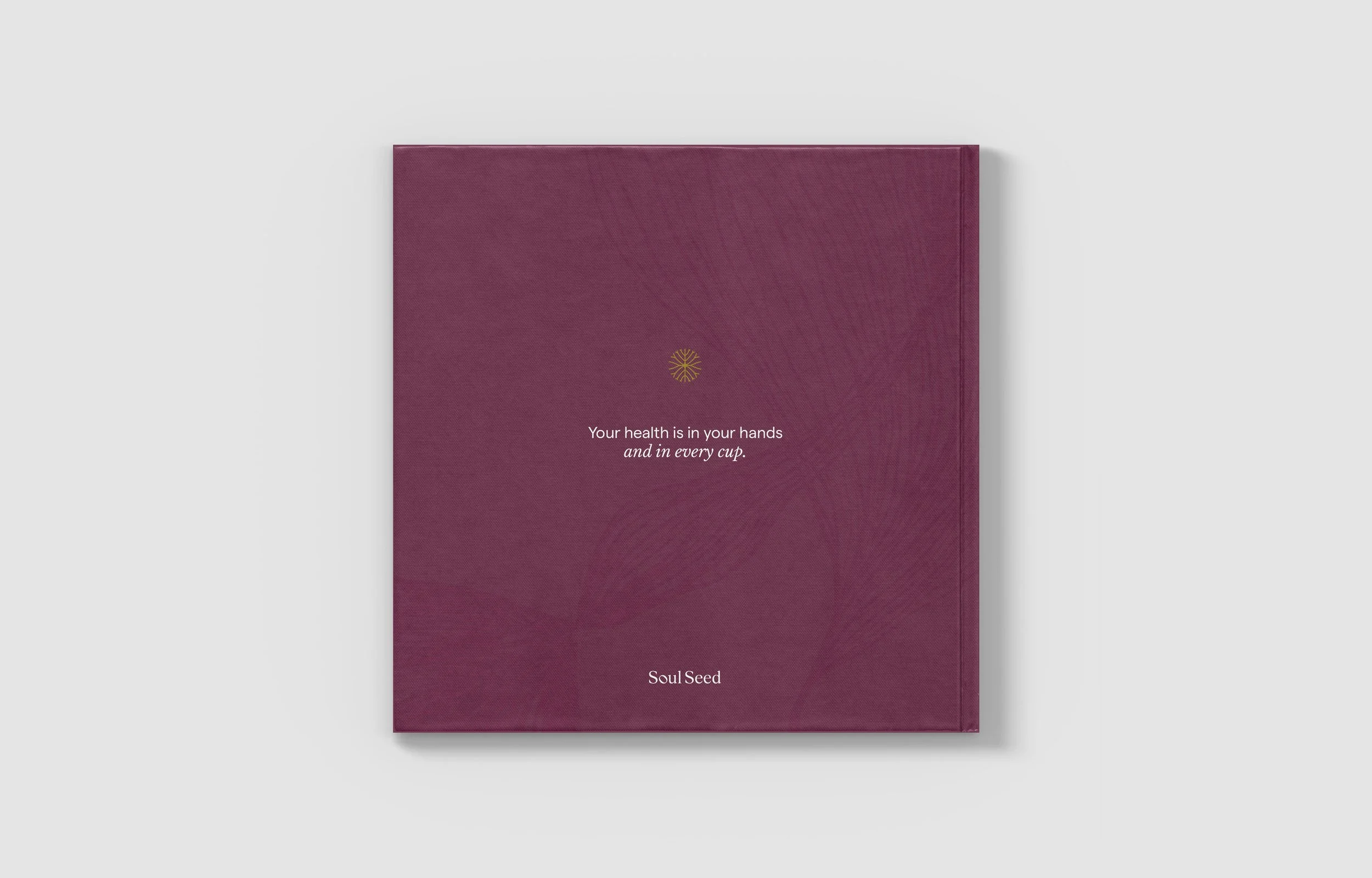
The sans serif and serif move between each other throughout all communication. An interchange that mirrors what the brand does every day - holding knowledge and feeling in equal measure. Never clinical without warmth. Never warm without substance.




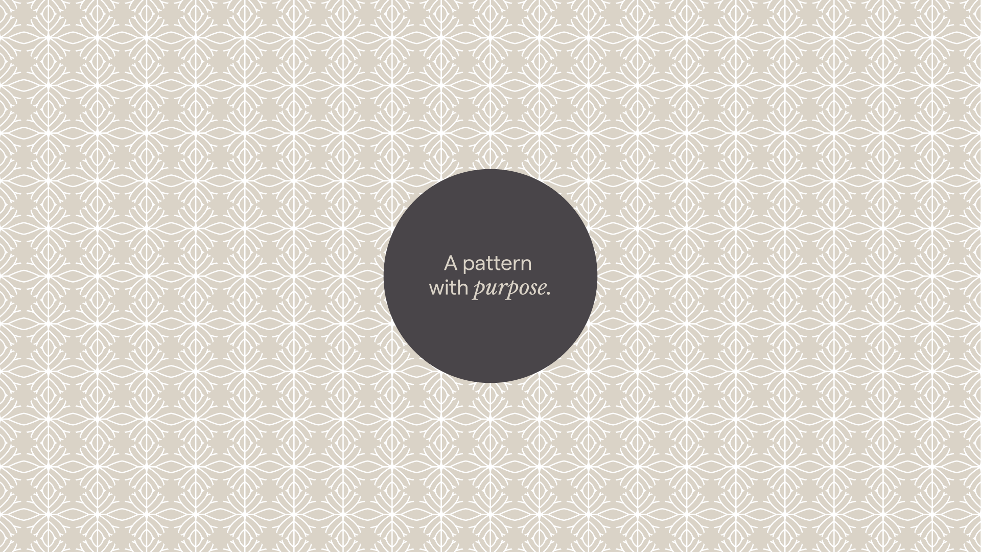
The pattern:A pattern with purpose.
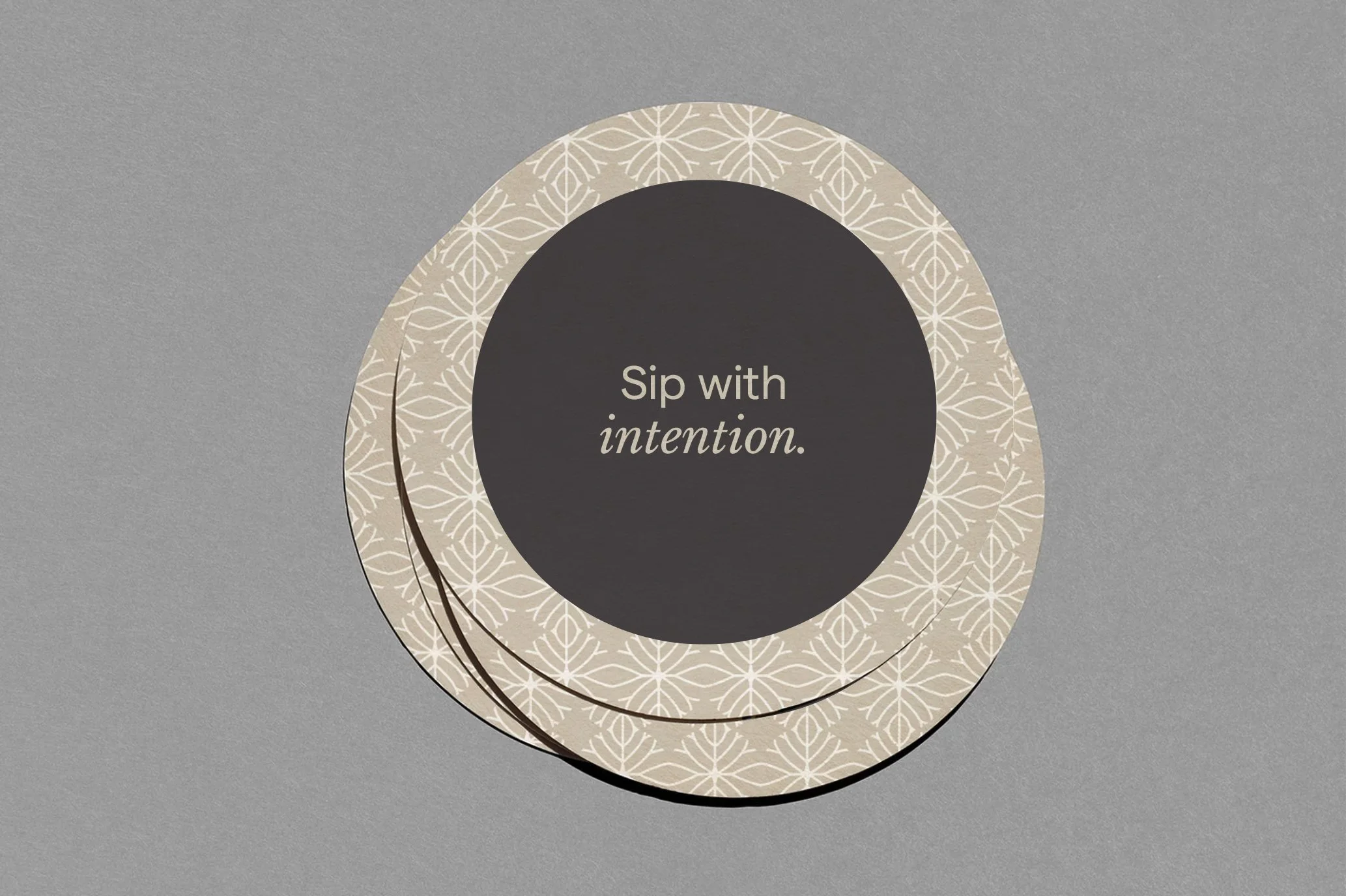
Built from the logo device, it extends the identity beyond the mark and across the brand’s surface. Packaging, coasters, cups and other collateral - connected by the same device, the same network, the same thread.

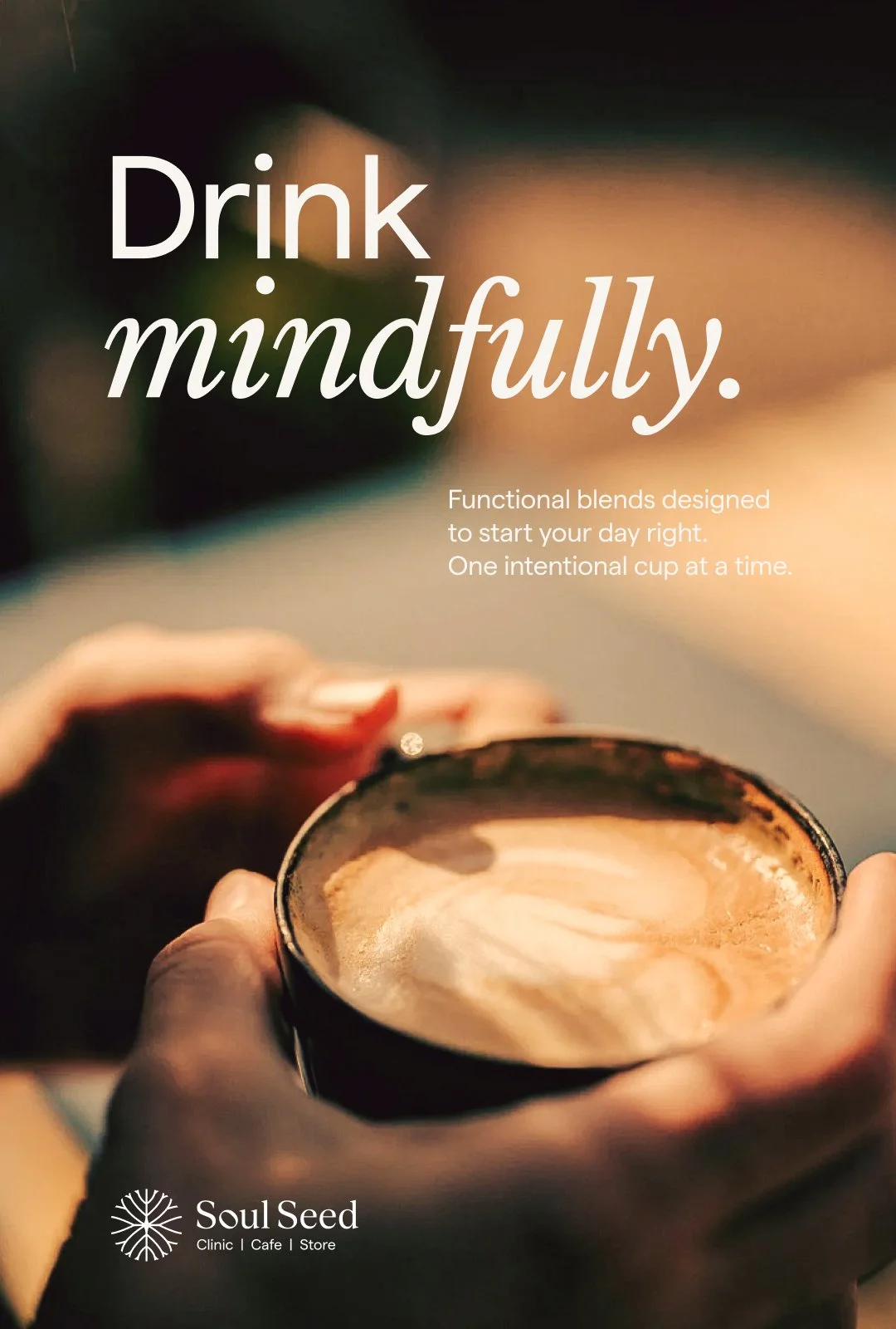
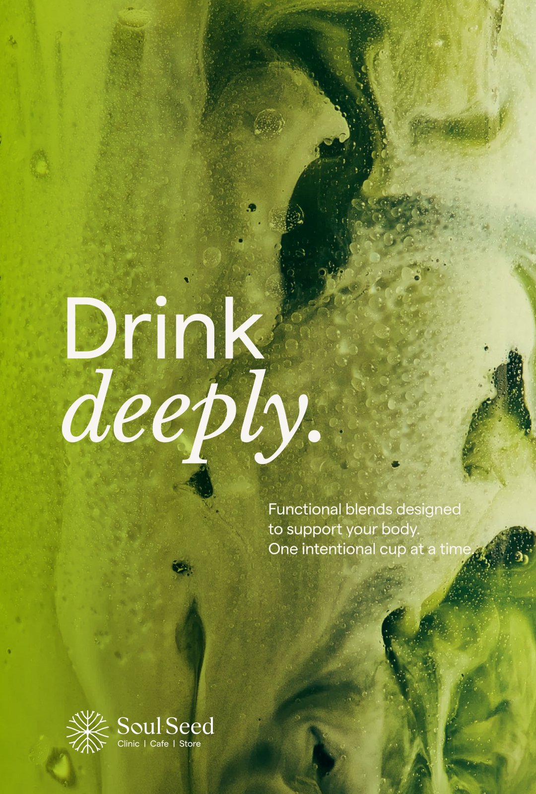
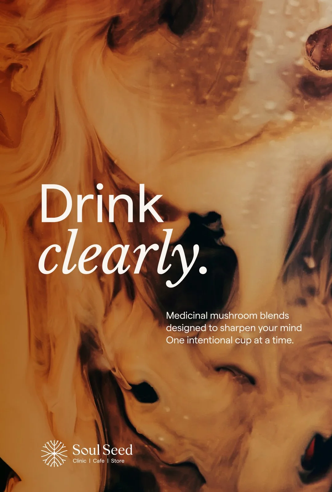
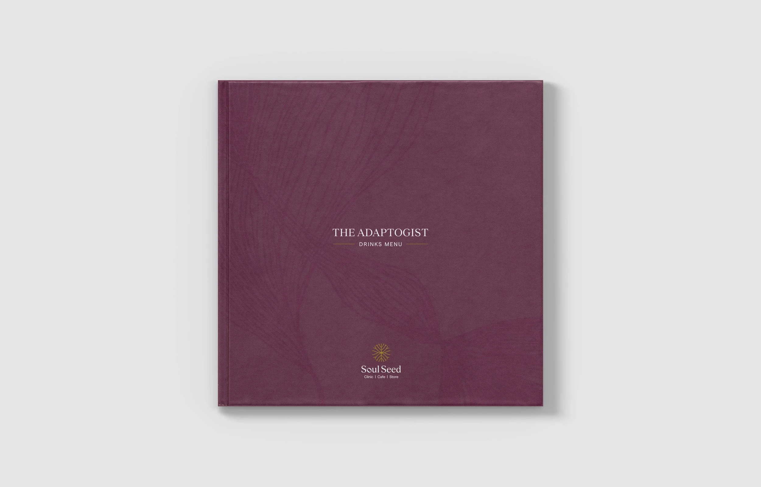
The ADAPTOGIST:Not every cafe is built around root knowledge.
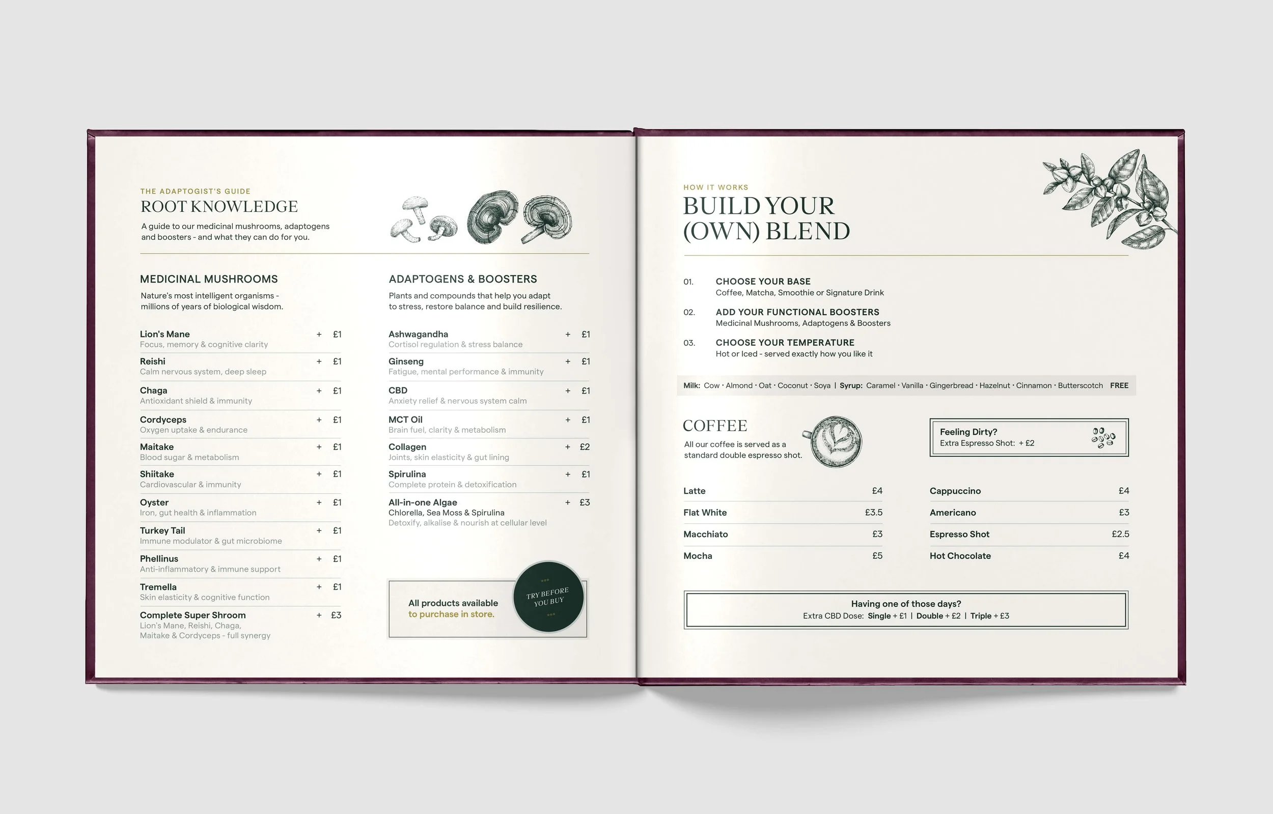
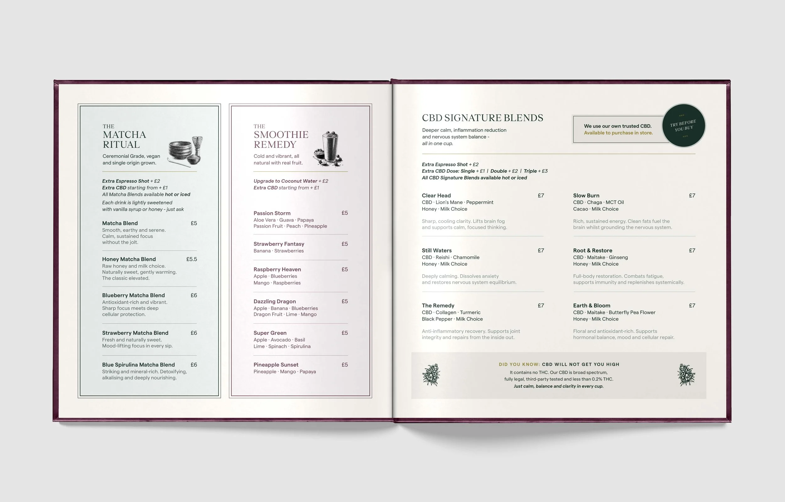
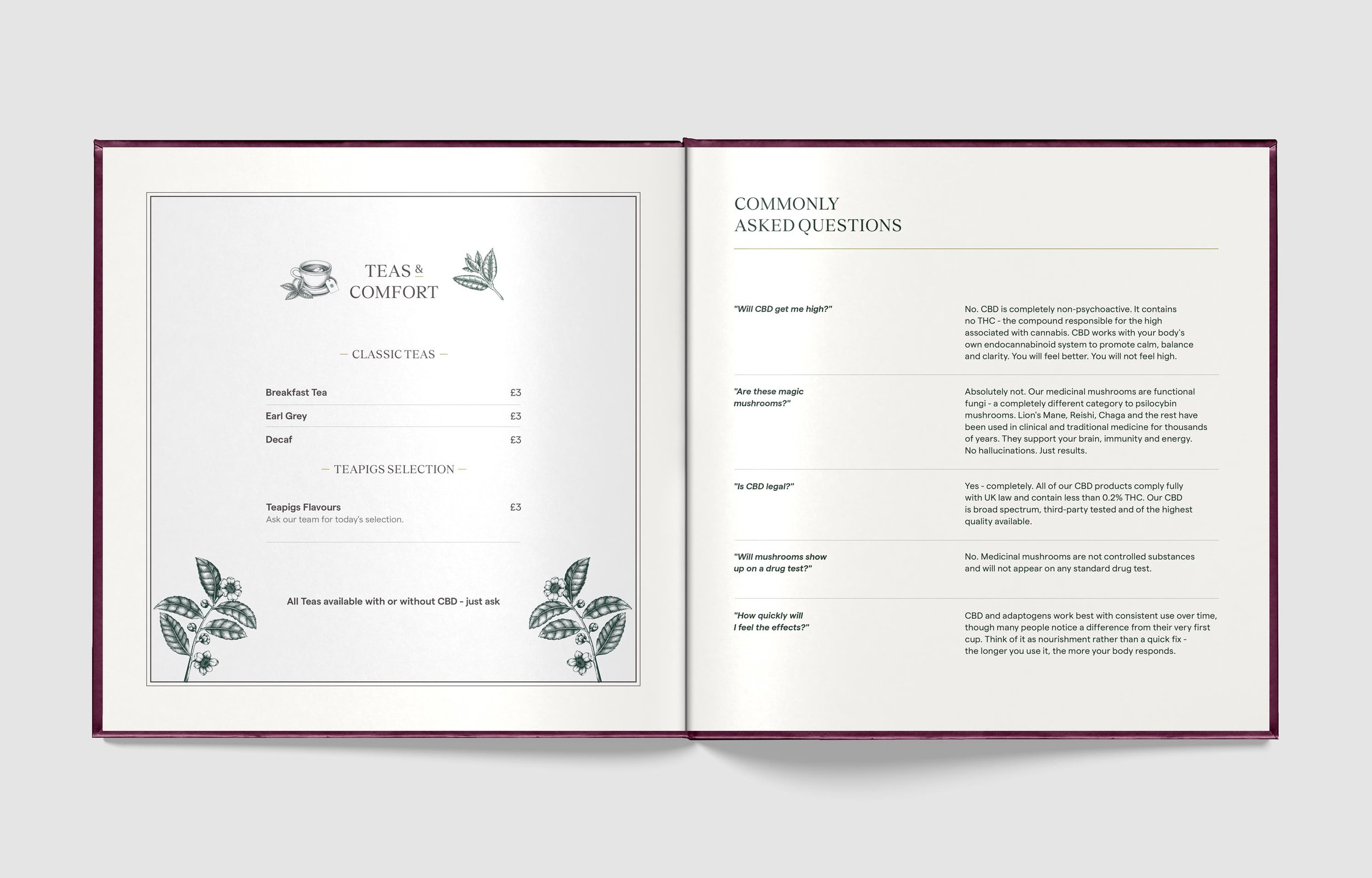
What looks like a coffee shop is something closer to an apothecary - a space where medicinal craft, ancient botanical wisdom and clinical intention intertwine in every cup. Where daily nourishment is taken as seriously as any protocol. Where the ritual of a morning or afternoon drink becomes an act of intentional healing.
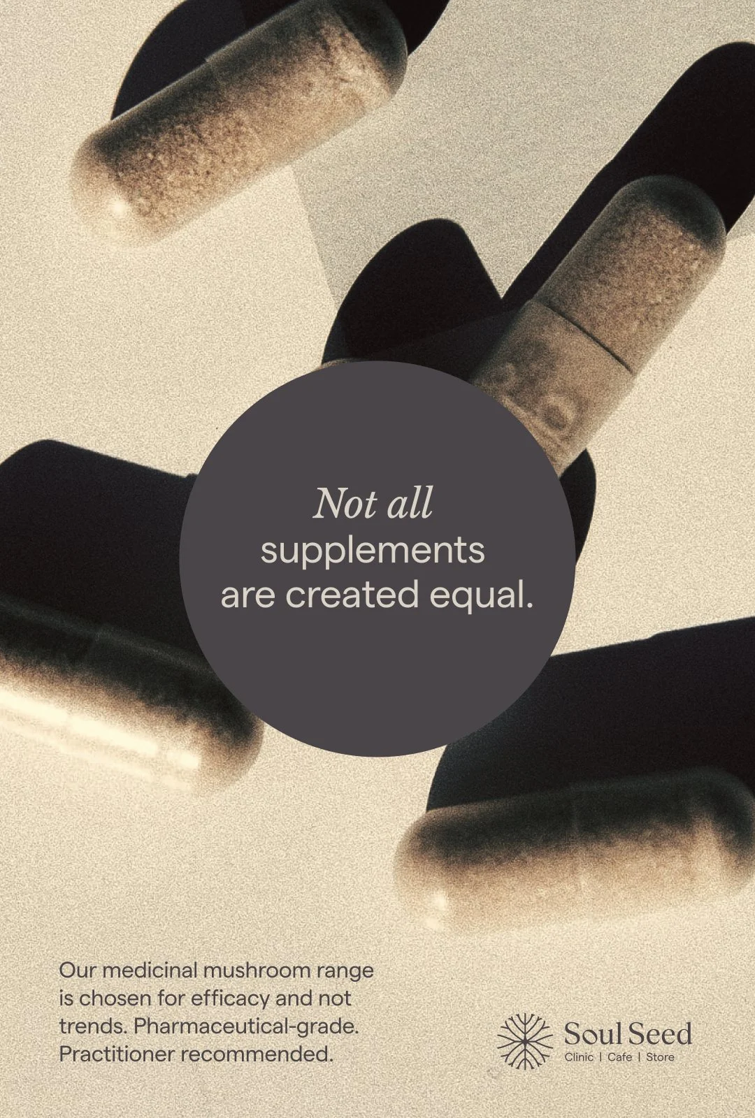
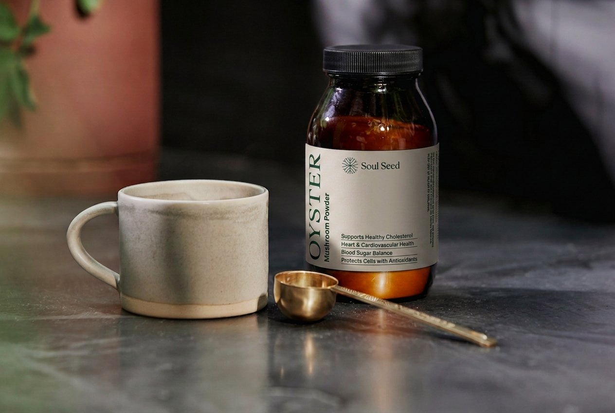
The medicinal mushrooms and adaptogens on the menu are the same products stocked in the store - in their pure form and in considered packaging designed to carry the same brand world from the counter to the shelf to the home.

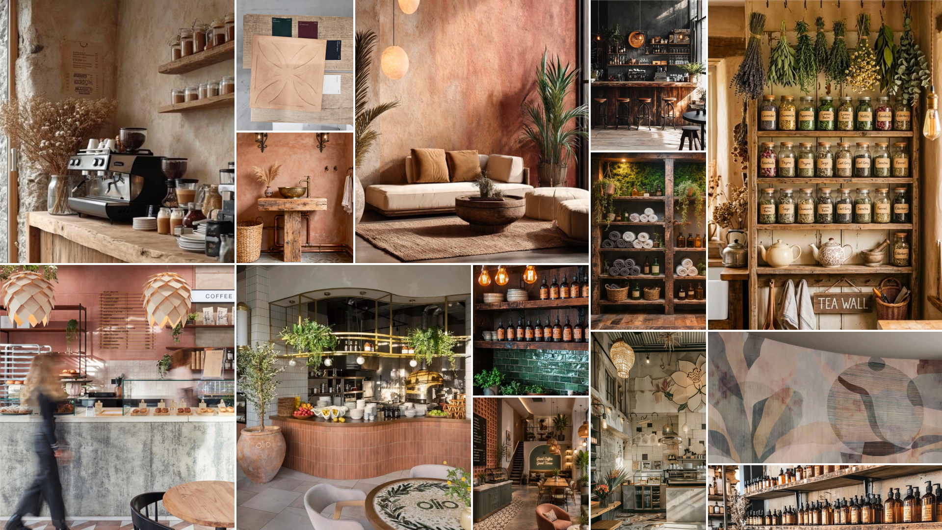
the spaceThese references were chosen to communicate a specific feeling. The sensation of being inside but connected to the outside. The comfort and grounding that comes from the natural world. The sense of being supported by something larger than the room you are in.
The intention was to bring that feeling indoors. To create a space, cafe and consultation room together, that felt as rooted, as nourishing and as alive as stepping outside into nature itself.
The outside, brought in. The brand world, made physical.
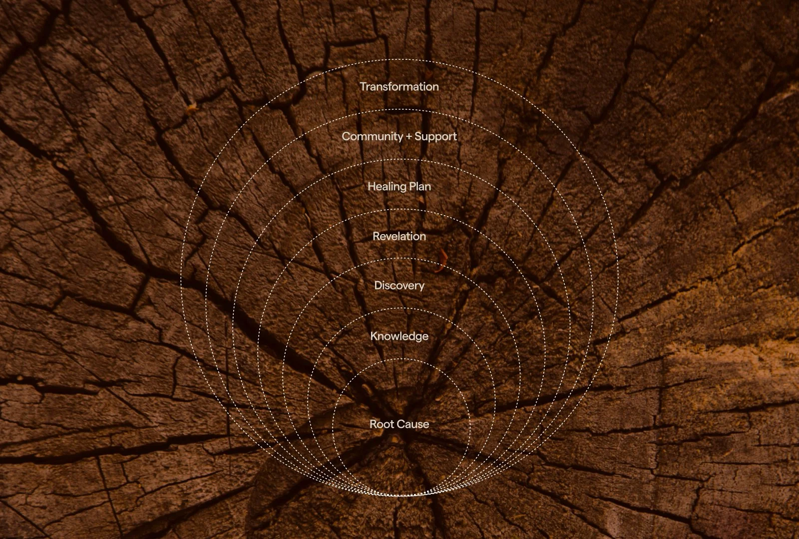
the threadEvery element of the identity traces back to one truth. That real healing begins at the root. The mark, the palette, the typography, the pattern, the menu, the space - all of it an expression of that belief. Clinical and human. Evidenced and felt. Rooted in nature and built for the people who have been searching for something that actually works.
Soul Seed is not just a brand. It is a place, a practice and a promise. And the identity was built to communicate all three - from the very first second of encountering it.